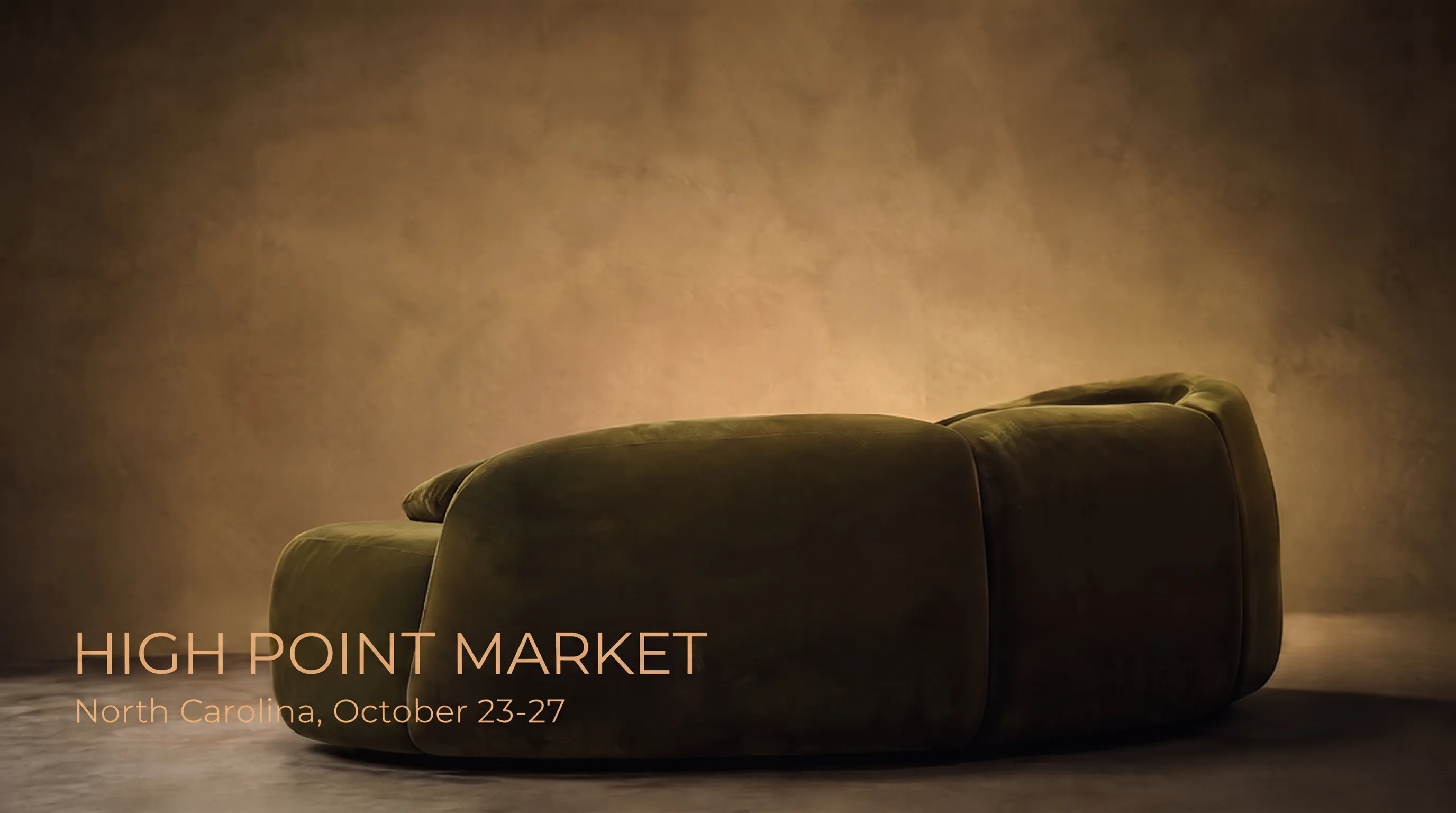
The summer season shifts the emphasis to light, slightly bleached natural tones — sand, pale green, milky white — instead of saturated, contrasting combinations. Here is where this trend comes from and why it outlasts a single season.
Moving away from bright, "plastic" tones
Recent seasonal forecasts from international studios and colour labs point the same way: the bright, saturated pinks and fluorescents that peaked a few years ago are giving way to softer, natural colours that create calm rather than visual excitement. A phrase repeated across several independent sources is that colour should "feel grown and natural, not manufactured."
This is not a one-off seasonal whim but a continuation of a longer shift — even in past years, major fairs noted fatigue with "one-dimensional," overly cool, calculated white, with major paint makers stating outright that such white is dying as a trend, giving way to warmer, livelier neutrals.
Bleached natural tones: what this means technically
Instead of bright contrasts, studios are showing bleached versions of natural colours — as if the shade had faded slightly and naturally in the sun, like fabric left on a windowsill for more than one season. Technically this means adding white pigment to a base natural tone without drifting into conventional "sweet" pastel — sand stays sand, not beige-pink, just loses some saturation.
Alongside bleached neutrals, interest is growing in natural blues and greens in a muted, "dusty" version — denim blue over cobalt, indigo over pure navy, mossy green over bright emerald. These hold as a separate direction alongside the pastel base, not instead of it.
- Sand and milky white — a bleached base for walls and large furniture
- Pale and mossy green — a natural accent without sharp contrast
- Dusty blue and indigo — deeper but still muted, for decorative details
- Terracotta and burgundy — bold accents in small doses, not the room’s main palette
Minimal contrast between furniture and walls: why it works
The summer palette works through closely related tones between furniture and walls — contrast is reserved for a single accent detail, not the whole room. When a sofa and wall differ by just a shade or two within one natural range, the eye has nothing to "argue" with inside the room, and attention shifts to light and texture instead of edges between objects — reading calmer and more spacious, especially welcome after a saturated winter palette.
Terracotta as a bridge between seasons
In forecasts built around a "Mediterranean" summer aesthetic, terracotta is named a key colour — warm and natural enough to work in summer alongside sand and milky white, yet saturated enough not to get lost come autumn next to deeper tones. It is one of the few colours designers deliberately keep through a season change rather than swapping the accent entirely.
How to apply it without overspending
The fastest way is to swap one large textile piece — a throw, a curtain, a set of cushions — for a shade from this palette, without touching the rest of the room. This works precisely because the summer palette is built on soft transitions rather than sharp contrast — even one new piece in the right, closely matched tone instantly reads as part of a considered scheme, not a random splash of colour.
Why this palette will not vanish after one season
Several independent forecasts for the coming seasons agree on one point — the move away from cool, sterile whites toward warmer, natural neutrals is not a local summer episode but part of a broader industry shift that colour analysts expect to continue. This means investing in a large furniture piece in this palette over summer is unlikely to look dated by autumn.
A note from a KALLEN HOME designer
"This summer clients more often ask for a 'bleached' shade than a pure pastel — they describe it as 'not quite white, but not coloured either.' In practice that means adding 5–10% grey or beige pigment to the base colour during fabric dyeing, not picking a ready 'summer' colour from a catalogue unchanged," says a KALLEN HOME designer.
By her account, this fine-tuning of the shade — not the choice between sand and pale green itself — usually takes the most time at the fabric-selection stage, since the difference between "bleached" and simply "light" only shows when comparing physical swatches, not on a screen.
Why white and beige lose ground, not disappear
An important nuance easy to lose in a trend summary: neutral tones do not vanish from the palette, they simply stop being the interior’s sole base and cede some ground to bolder, if muted, choices — burgundy and red as accents, deeper blues and greens in decorative details. White and beige remain part of the summer palette, just sharing it with other natural tones rather than monopolising the room the way they did through recent minimalist seasons.
How this palette plays out in different room types
In a bright, south-facing living room, the bleached natural palette works almost effortlessly — natural light itself amplifies the "sun-touched" effect. In a north-facing or low-light room, the same sand or milky tone can look plainly grey and lifeless without enough warm artificial light — there the palette needs more attention to light sources than in a sunny room, or the whole summer effect falls flat.
Texture matters as much as colour
The same bleached sand tone looks different on smooth cotton than on textured herringbone weave — the textured fabric adds soft shadows within the colour itself and reads livelier, even at an identical nominal shade. This is why design studios rarely limit a summer palette presentation to one fabric type — texture combination works as strongly as the shade choice itself.
Accents: where contrast is actually allowed
One bold accent per room is not an arbitrary rule but protection against visual noise — with several contrasting details, the eye cannot settle on a focus, and the room loses the very sense of calm the bleached base was chosen for. The sensible practice is picking one attention zone — sofa cushions, one armchair, a table vase — and giving it all the contrast, keeping the rest of the room within one natural range.
Trend longevity versus fabric longevity
Two different questions are worth separating — will the shade stay fashionable next year, and how long will the fabric itself physically hold up. Bleached natural tones have the practical advantage that minor fading and natural colour ageing are almost invisible on them, unlike saturated contrasting combinations, where even a slight shift in one of two colours instantly breaks the whole contrast. So investing in this palette for large furniture makes sense not just fashion-wise but for how the colour will look after several ordinary years of use.
How this palette pairs with wood and stone
Bleached natural textile tones pair especially well with light, bleached oak and light, matte stone — materials that have already undergone a similar "lightening" treatment themselves and visually speak the same language as the fabric. Dark walnut or deep dark granite next to this textile palette create not an accent contrast but a mismatch, since the two materials tell different stories — one about natural restraint, the other about richness and weight.
A practical list for a quick summer refresh
- One large textile piece (throw, curtain) in a bleached natural tone — the fastest, cheapest step
- One accent detail (cushion, vase) in a richer shade from the same natural range — contrast without overload
- Checking the match with the room’s wood and stone under daylight and evening light before buying fabric
- Choosing a genuinely bleached, not just light, tone — undertone decides whether the effect reads "summer" or just pale
The difference between a seasonal trend and personal taste
It is worth honestly separating two different motivations for an order — following the season’s current palette, and a stable personal preference for natural, calm tones unrelated to fashion at all. If bleached natural tones appeal on their own merits, not because "this season showed them," that is a far more reliable basis for a large furniture fabric meant to last years than chasing a specific trend report valid for exactly one season.
How the workshop turns a trend into a specific fabric number
The phrase "sand, slightly bleached" from a trend report is not itself an order — it has to translate into a specific catalogue fabric number with a specific percentage of white pigment in the dye. Different suppliers interpret the same verbal description differently, so the final decision is made only after the client has seen and held the physical swatch, not a text or on-screen colour description.
The bottom line: one seasonal move is enough
From this whole breakdown, one practical rule is worth keeping — the summer palette works through close, not contrasting, tones, and in most cases a single change is enough to apply it: one large textile piece in a bleached natural shade, chosen not from a trend report’s wording but from a physical swatch checked against the room’s own wood and stone.
One last thing worth keeping in mind for any seasonal refresh: the palette changes, the room’s architecture and large furniture do not — so it makes more sense to invest in a shade where it is easy to swap next year if the trend shifts, not in the one large piece meant to serve a decade regardless of whatever colour gets called fashionable next summer.
Why design studios show seasonal palettes ahead of time at all
Colour forecasts are published months ahead of the season not to entertain readers but for the industry’s production cycle — textile mills and furniture brands need time to dye fabric batches and prepare collections before buyers actually come looking for summer furniture. By the time a private buyer reads such a round-up, the supply chain is already building its plans around that palette, and demand in shops and workshops grows alongside the publications, not after them.
Why contrast with wood and stone matters more than contrast between cushions
When summer-palette contrast comes up, attention usually goes to textile combinations — cushions, throws, curtains — though the most noticeable contrast in a room forms between textile and large fixed surfaces: flooring, wall panels, a tabletop. A bleached natural upholstery tone next to dark parquet works differently than the same tone next to light bleached oak, and that large-scale pairing, not small decor details, decides a room’s first-glance impression.
How to check the palette under evening artificial light
Bleached natural tones work well in daylight, but in the evening, under warm artificial light, the same shade can visually "yellow" and lose its freshness if the bulb runs too warm a colour temperature. Before the final order, it is worth viewing the fabric swatch not just by daylight at the window but in the evening under the lighting the room will actually use most — that evening check often shifts the decision toward a slightly cooler shade within the same palette.
The whole article’s main point reduces to one practical action — before ordering fabric for a summer palette, bring a physical swatch home and live with it for at least a few days, watching it under different light and next to the room’s existing materials, rather than trusting a trend report’s wording or a screen photo alone.
Seasonal palette round-ups are best treated as a starting hint, not a mandatory finished recipe — the final decision is still made in one specific room, under its specific light, alongside its specific existing furniture, not in the studio where the report’s photos were taken.
Frequently asked questions
Which shades are current this summer?
Sand, pale green and milky white as a base, plus terracotta and dusty blue as restrained accents.
Do you need to replace all furniture for a seasonal palette?
No, usually one large textile piece in the new shade is enough — a throw, a curtain or a cushion set.
Does this palette suit custom furniture?
Yes, the upholstery shade is chosen individually, including how "bleached" the base colour is via added grey or beige pigment.
Why does terracotta stay relevant in both summer and autumn?
It is warm and natural enough for the summer palette, yet saturated enough not to get lost next to deeper autumn tones.
Is this a one-off summer trend or a longer direction?
Several independent forecasts agree the move from cool whites to warm natural neutrals will continue into coming seasons.