Spring shifts the palette from saturated winter tones to soft pastels and light wood — but this year’s pastel differs from the pastel of five years ago, and the difference is not the shade itself but what sits next to it.
Pastel is not returning alone — it comes paired with earthy tones
The main difference from past pastel seasons is the neighbour. Pastel used to pair with white and grey for a light but cool result; this season studios pair it with warm earthy tones — clay, sand, walnut — which is described as the real source of the cosy feeling, not the pastel itself.
From terracotta to powder tones
Winter’s warm terracotta and mustard give way to powder pink, pale sage green and sand — a calmer palette that softens rather than erases the winter one, which survives in accent details while the bulk of textiles lightens.
Why sage green specifically gets called this season’s colour
Sage green — a muted, greyed-out tone of green — appears more than other pastels in this season’s round-ups, specifically for bedrooms and relaxation zones, associated with nature and recovery without reading as bright or childish the way clean mint did a decade ago.
Light wood instead of dark
In frames and legs, light oak and bleached wood read as more current than dark walnut veneer — dark wood creates too sharp a contrast against pastel textiles and visually weighs the light palette down, while pale wood continues the same logic, both looking gently sun-softened.
Colour psychology: why earthy tones read as calming
Designers and materials writers consistently link earthy and pastel tones to psychological comfort — a professional observation repeated season after season, not a strict scientific claim. Light tones like peach visually enlarge a room by reflecting more light, while deeper pastels like mustard or terracotta visually shrink and warm a space, which is why they stay in accents rather than large surfaces.
- Peach, powder, milky white — light tones that enlarge a room, good for a sofa’s large surfaces
- Sage, dusty pink — mid-saturation tones, good for bedrooms and relaxation zones
- Mustard, terracotta — deeper accents, better on cushions or one piece than a whole room
- White and pale grey — a neutral base that makes pastel read brighter without its own contrast
How this season differs from pastel five years ago
A few years ago, pastel in interiors paired with cool grey minimalism — the same powder pink next to blue-grey walls read neutral rather than warm. The current wave changes the pairing: pastel now sits with the clay and sand tones that peaked on their own a few seasons back — not a new colour, but a new combination of familiar ones.
How to try it without extra cost
A couple of cushions or a throw in a new shade change a room’s feel within an evening, with no need to replace the furniture — the fastest way to test a shade in your own room rather than a catalogue photo under showroom lighting.
The next budget step is reupholstering one accent chair or pouf in the new shade — noticeably cheaper than replacing a sofa, and enough to judge the effect on a large piece before committing the main furniture.
Where pastel does not work as expected
In a north-facing room with limited daylight, light pastel can read grey and flat rather than soft — cool diffused light does not let it "open up" the way sunlight does. In such rooms it helps to lean toward warmer pastel undertones, or add warm artificial light to compensate.
Where the word "pastel" actually comes from, and why it is not just "light colour"
The word "pastel" comes from painting — dry pigment sticks with a lot of chalk binder, giving a characteristic velvety, slightly dusty colour effect, unlike bright, saturated oil paint. In interiors the word inherited that dustiness, not just lightness: a light pink that is clean and bright is not strictly pastel, just a light shade. True pastel always carries a touch of grey or beige undertone, which is what creates the softness.
Which finish holds pastel better: matte or sheen
Pastel reads differently depending on the fabric’s surface. On matte cotton or herringbone it looks soft and even under any light; on a fabric with a light satin sheen — some viscose blends — the same shade can look lighter in direct light and noticeably deeper in shadow, adding depth but demanding more careful room lighting.
For a sofa sitting in direct window light most of the day, a matte surface is usually safer — it avoids the glare that can visually wash out a pastel shade at the brightest hours. Satin sheen shows better under softer evening light, where brightness swings are less extreme.
Pastel and children: how practical is it really
A common worry is that light pastel upholstery cannot survive a house with children. In practice, what matters is the protective finish and weave density, not the shade itself — light fabric with a good dirt-repellent treatment copes with kids no worse than dark fabric of the same composition; stains are just slightly more visible before they are cleaned, not after. The difference is more psychological than technical.
For families still wary of light colour, a sensible compromise is pastel on cushions and a throw while the main seat upholstery stays a mid, slightly denser tone of the same palette — keeping the refresh effect while making the highest-contact zone more practical.
Pastel paired with different wood tones
Beyond light oak, pastel pairs surprisingly well with warm, pale ash and beech — wood with no strong red undertone recedes into a neutral frame rather than competing with pink and green pastels. Walnut and mahogany, by contrast, bring their own warm colour that can clash with cool pastels like blue or lilac.
A separate nuance is metal hardware and legs near pastel textiles. Matte brass and aged bronze support warm pastel better than cold chrome or black steel — shiny cold metal visually argues with pastel’s softness, reading as accidental rather than deliberate. In practice this means checking a new pastel throw or cushion against the sofa legs’ colour, not just the fabric.
How many pastel pieces a room needs for it to read as style
One pastel piece in an otherwise neutral or dark room often looks like a random accent rather than part of a deliberate palette — the eye reads it as an exception, not a rule. Designers usually suggest at least two pieces in related pastel tones within sight of each other — a cushion on the sofa and a throw on the chair opposite — so the colour reads as intentional, not incidental.
A third piece in the same palette is the point to pause and check for overload — if pastel repeats five or six times in one room, the eye has nowhere to rest as a neutral pause, and the softness paradoxically starts to tire just as much as the grey monotony it was meant to replace. Large neutral surfaces — walls, floor, a plain main upholstery — must stay between pastel accents to give the colour room to breathe.
How pastel behaves in photos versus in real life
Pastel furniture in catalogue or social-media photos almost always looks brighter and cleaner than in a real room, because studio lighting is set to even out tone and remove the shadows an ordinary flat has constantly. In real life, the same pastel sofa under one window and a couple of lamps inevitably shows more half-tones and light unevenness — not a flaw in the furniture, just the gap between controlled studio shooting and everyday mixed light.
A sensible way to prepare for this gap is to look at several photos of a similar fabric from different sources, ideally shot in natural light in a lived-in room, not only in a studio. It will not guarantee an exact match for a specific room, but it narrows the gap between the photo-based expectation and what is actually visible a week after delivery.
A note from a KALLEN HOME designer
"Clients hear 'pastel' and worry it will look childish, but the issue is almost always purity of tone, not the colour itself. A clean pink without a grey undertone does look toylike; the same pink dusted down reads completely differently on the same sofa — calmer, more adult," says a KALLEN HOME designer.
She suggests requesting a swatch at least A4-sized before ordering a whole sofa in a pastel shade, and keeping it in the room for at least a day — morning and evening light change how the tone reads on a large surface. She also recommends photographing the swatch under different lighting and comparing the shots later, rather than trusting one quick impression in the showroom.
In the end, a spring colour trend is not an instruction to follow fully and only while it is current, but more an invitation to look closer at a palette that can live in a home far longer than one season, if chosen deliberately rather than chased for fashion. Pastel matched to one’s own lighting and colour habits rarely wears thin in six months — if anything, it is the hasty, trend-chasing choice of a bright seasonal colour that tends to fall out of favour fastest.
What design studios themselves say about pastel this season
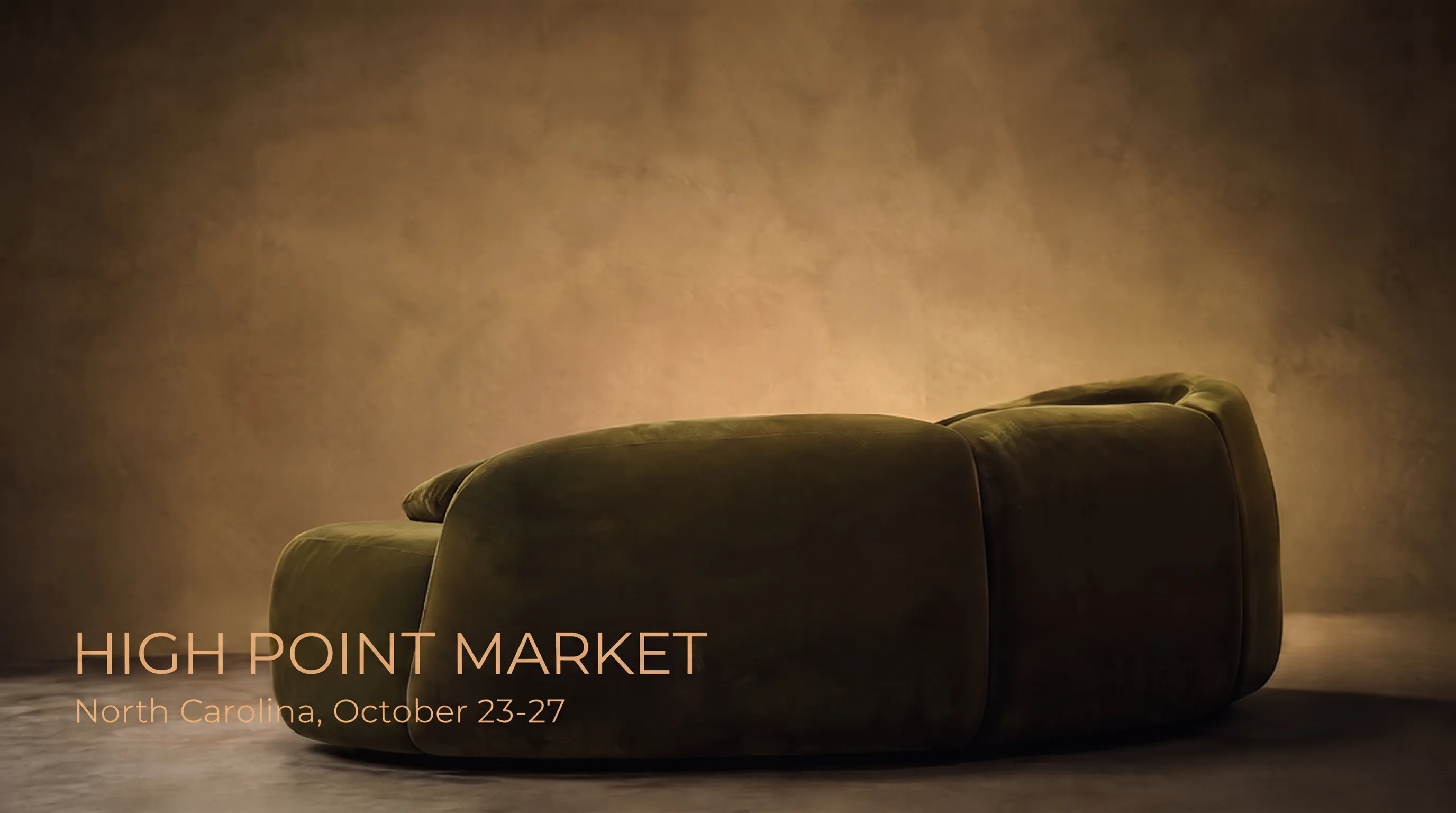
At this season’s January and spring interior fairs, pastel tones appear less as a stand’s own theme and more as part of a broader conversation about natural, earthy materials — shown alongside wood, ceramics and muted stone rather than standing alone, reinforcing the idea that pastel by itself is not the trend; the combination is.
This also explains why the trend has survived several seasons in different variations without feeling repetitive: what changes is not the idea of a soft natural palette itself, but the specific tones and their pairing — making it a durable direction rather than a one-off fad around a single colour of the year.
How pastel ages on furniture compared with bright colours
Pastel tones have a practical advantage rarely mentioned alongside aesthetics — they age far more gracefully under natural fading and years of wear. A deep, saturated colour fades into a sharp, obvious contrast between the faded and original patch, while an already slightly dusty pastel tone ages almost invisibly, since the gap between "new" and "slightly duller" light colour is minimal to the eye.
What to check before ordering furniture in a pastel shade
- Are there large neutral surfaces for the pastel to read against, rather than get lost in
- Which way do the windows face — a north-facing room needs a warm, not cool, pastel undertone
- How many pastel pieces are already in the room — two or three related tones are usually enough
- Does the chosen shade suit the metal hardware and furniture legs already in the room
Frequently asked questions
Does a pastel palette suit custom furniture?
Yes, the upholstery colour is chosen individually to match any spring shade, including mixing tones on one piece.
How long does this trend typically last?
The spring palette is usually relevant through the whole warm season, though the earthy tones underneath it tend to last longer than one season.
What does pastel pair with best?
With warm earthy tones and light wood — this pairing is what sets the current trend apart from the cooler pastel of past years.
Does pastel suit a north-facing room?
Yes, but lean toward warm pastel undertones rather than cool ones — without sun, cool pastel can read grey and flat.
Why does pastel sometimes look childish?
It is about tone purity — a clean colour without a grey undertone reads as toylike, while a dusted, muted version of the same colour looks more adult.