"Quiet luxury" is an old principle under a new name — material quality over logos. Where the term came from, and what of it actually applies to furniture, not just a wardrobe.
Where the term came from, and why everyone started using it that one spring
The underlying principle — craft over visible status — traces to the aesthetic of Europe and America’s wealthy classes forming as early as the late 18th century, when restraint began replacing displayed wealth as an "old money" marker. The term itself, in its current form, peaked in spring 2023.
The spike is tied to concrete cultural triggers: HBO’s "Succession," where characters display wealth through unbranded quality, and Gwyneth Paltrow’s courtroom appearance the same year — her plain turtleneck and The Row coat drew more social-media attention than the trial itself.
What researchers call the triggers behind this style
Academic work on this aesthetic’s appeal identifies belonging to elite social groups and a lasting connection to craft and design as two separate but intertwined factors — the style works simultaneously as a social marker and an objective quality judgement.
How it differs from stealth wealth — a related but distinct idea
Stealth wealth means literally hiding affluence — nothing signals income level at all. Quiet luxury works differently: status is signalled subtly but legibly to those who know what to look for — cut, fabric density, stitch precision read as quality markers, not concealed entirely.
What the same principle looks like in furniture, not clothing
In clothing the signal is the absence of a visible logo paired with flawless cut. Furniture has no direct equivalent of a logo, so the principle translates through other details — no decorative carving in favour of flawless proportions, an even upholstery seam that is not noticed immediately but defines the sense of quality up close.
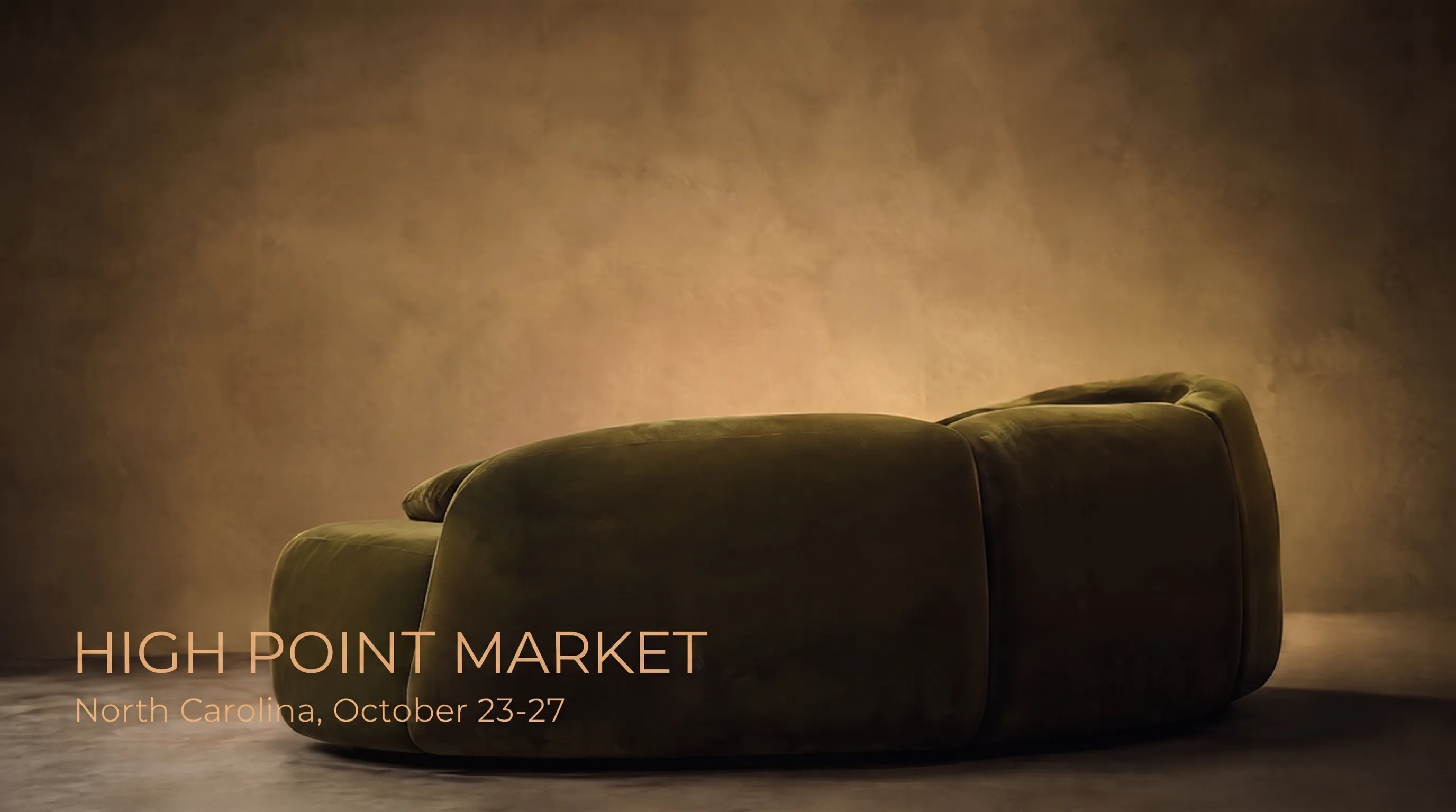
Fabric composition and filling density take the lead over a recognisable print or a bold accent colour. Wool, linen and dense velvet in calm, non-contrasting tones read as this style’s signal better than any ornament, because their quality is visible and tactile without added decoration.
How this differs from 2000s-era minimalism
Easy to confuse with the minimalism that dominated interiors fifteen to twenty years ago, but the difference is fundamental: 2000s minimalism was about emptiness and geometry; quiet luxury is about density of quality per object, not fewer objects.
Proportion and seam — the detail only visible up close
Because there is no decoration, proportion carries all the meaning ornament used to carry — a slightly different armrest radius or a few centimetres of back height change the whole shape’s perception more than expected, with no carving to hide an imperfect proportion behind.
- Fabric composition and density matter more than a printed label
- An even, unobtrusive seam line signals high-level handwork
- A calm, non-contrasting palette over a bold accent
- Flawless proportion instead of carving and decorative trim
Which brands get called exemplary — and what that means for furniture
In fashion, The Row, Khaite and Jil Sander are named as exemplary — brands that avoid loud branding and build reputation on cut and material. Furniture has no direct equivalent of a visible logo, but the principle transfers through quality visible without a signature.
Colour here is not abstractly "white" or "beige"
It is easy to reduce this to "just white or beige," but the more accurate description is "muted natural tones" — deep olive, graphite, terracotta all qualify if the colour is not loud or contrasting for attention’s sake.
How to tell real material quality from a convincing imitation
The practical difficulty of this style is that without a logo to rely on, a buyer must judge quality by hand — weight per square metre and how fabric behaves under light stretching separate real quality from a cheaper look-alike within seconds.
Texture without decoration: fabric that "does the work" alone
Without print or ornament, all of fabric’s expressiveness shifts to its weave and how it catches light — a coarse herringbone or a raised bouclé loop starts reading as a decorative element in its own right, even though it is just fibre structure doing that work now.
How to judge real quality by hand, not by eye
- Fabric weight in the hand — dense quality cloth feels noticeably heavier than a thin look-alike
- Behaviour under light stretching — good fabric does not show through and snaps back fast
- Seam evenness up close, not just from showroom distance
- The smell and feel of real wood or leather close up — imitation rarely matches it exactly
The link to mindful consumption is not a coincidence
Researchers studying this style’s appeal note its link to the broader mindful-consumption movement — a well-made piece outside fast-fashion cycles simply lasts longer and gets replaced less often, a natural fit for furniture more than for clothing capsule collections.
Why this is easier to apply to furniture than to clothing
A wardrobe changes by season almost by definition, and even a high-quality garment feels temporary. Furniture lives in a room for years or decades, so planning for durability requires no extra willpower the way it does with clothing — it simply matches how the category is already perceived.
Will this trend survive the next fashion cycle
Loud trend names usually live one or two seasons on social media, but the principle behind "quiet luxury" existed before the term and will outlast its disappearance from headlines, because it describes an approach to material and proportion, not a specific colour or shape tied to one year.
Wood in this aesthetic: species matters more than finish
The principle carries to wood the same way — a matte oil finish over glossy lacquer, emphasising grain rather than hiding it under a coating. Oak and walnut finished this way read as material, not as an object trying to look pricier than it is.
Hardware: matte metal over bright shine
Legs and hardware here lean matte over glossy — aged brass, matte black metal, brushed steel without a mirror shine. Bright chrome reads as an accent drawing attention to itself rather than the piece’s overall form — exactly what this principle works against.
A common mistake: copying the look with cheap materials
The most common mistake in a budget version of this look is keeping the calm palette but using thin fabric or veneer instead of solid material — it looks similar in photos but feels different on contact, and does not age the same way. This aesthetic cannot cut corners on material, because material is the content of the style, not just a backdrop for colour.
KALLEN HOME and this style: not a new direction, an old practice
In the company’s catalogue, dense solid fabrics, a calm palette and no decorative carving were the baseline long before the term became popular — models designed years ago fit this trend without a single change, because they were built on the same principles from the start.
This is not a claim of foreseeing the trend — more an honest observation that a material-first, built-to-last approach eventually aligns with any trend valuing the same things. Fashion cycles, material quality does not, which is why the catalogue needed almost no change when a new name appeared for an old principle.
How to try the effect without a renovation or a big budget
One piece in a dense, solid-colour material with a calm shape often changes a room’s perception more than several bright accents at once — one wool armchair or one reupholstered plain-linen sofa can set the tone for the whole room.
It makes more sense to start with the piece touched most often — an armrest, a cushion, a throw — rather than the largest object in the room. Direct tactile contact is where the gap between dense quality fabric and a thin imitation registers fastest.
A useful reverse exercise: photograph the room, mentally strip out every bright accent, and check whether the result looks more interesting, not poorer. If it does, the bright details were likely competing with the material, not complementing it.
A second, almost free step is removing one bright object rather than adding a calm one. The effect of restraint is often more visible from subtracting an excess accent than from adding one more "correct" detail — a stray bright throw can undo the effect of an otherwise perfect new chair.
A fifth step costs nothing at all — simply live with the new piece for a month or two before changing anything else in the room. The effect of restraint often shows gradually, not instantly, and swapping another detail too soon can smother it before it registers.
A fourth, nearly free step — simply remove packaging or tags from sight in the rare case something still carries store-display traces. The restrained effect breaks not from the material but from details signalling a recent purchase rather than a lived-in object.
A third, less obvious step is checking existing furniture before buying new — a structurally sound sofa with tired fabric, reupholstered in a dense solid material, often achieves the same effect as a new piece, at a fraction of the cost.
A note from a KALLEN HOME designer
"We have been making furniture this way long before it got a fashionable name — dense fabric, a precise seam and a calm colour have always been the catalogue’s foundation, not one season’s fad," says a KALLEN HOME designer.
Frequently asked questions
What does the term "quiet luxury" mean?
An emphasis on material quality and form over visible decoration or logos — an old principle, a name that became popular in spring 2023.
How does quiet luxury differ from stealth wealth?
Stealth wealth hides affluence entirely; quiet luxury signals it subtly but legibly, through material quality and proportion.
How does this differ from the minimalism popular before it?
Minimalism was built on emptiness and geometry; quiet luxury is built on quality density per object, regardless of how many objects are in the room.
Which materials best convey this style?
Wool, dense velvet and linen in calm natural tones, without print or contrasting accents.
Does this style suit custom-made furniture?
Yes, custom furniture makes it easy to get proportions and material exactly right without extra decoration — exactly what this approach calls for.