In a 240 sqm house at the edge of a pine forest near Moscow, the clients asked for the window view to stay the room’s main feature, with furniture as a quiet backdrop. Solved not by sparse furnishing, but by precise material choices — here is how.
Why this case is worth a detailed breakdown at all
Most workshop case studies on furniture sites describe the outcome — what was made and how it looks in photos. This one works differently: the interesting part is not the result itself but the logic that ruled out more obvious alternatives in favour of what actually went into the house. Understanding that logic is useful for anyone planning an interior around a strong view — sea, city skyline, a park — unsure where to start with materials.
A brief that sounded like a restriction, and turned out to be a task
The clients’ brief was simple and, at first glance, awkward for a designer: "let the forest outside stay the main feature, and the furniture not compete with it." In practice this does not mean an empty room — it means a disciplined choice of every material against one test: does it visually fight what is visible through the glass at any time of day.
The 240 sqm house stands literally at the forest edge — not marketing exaggeration, several rooms look straight onto tree trunks, not a distant hint of greenery. That proximity changes the whole approach: usually furniture and decor create a room’s focal points, but here the focal point already exists outside, and design’s job is to stay out of its way.
A full-height window as the room’s main feature
In the children’s bedroom, a full-height window opens straight onto pine trunks lit from below by the evening sun — an effect the clients named as one reason they chose this plot. Any bright furniture detail would visually compete: a saturated colour or bold pattern would inevitably pull the eye away from the window toward the headboard instead.
Mustard velvet instead of neutral grey: why the obvious choice was avoided
The most intuitive "quiet backdrop" choice would be neutral grey or beige, a fully colourless silhouette. This project went another way: the headboard is upholstered in warm mustard velvet with soft rolled bolsters. Mustard is not neutral on its own, but in this combination it extends rather than contrasts — its warm tone echoes sunset light on bark and needles instead of fighting it with a cold grey patch.
Beside the headboard stands a lacquered terracotta nightstand — a second warm note reinforcing the same colour logic rather than introducing a new one. Two functionally different pieces in one warm palette read as a single deliberate decision, not furniture assembled piece by piece.
Light oak keeps the wall from feeling crowded
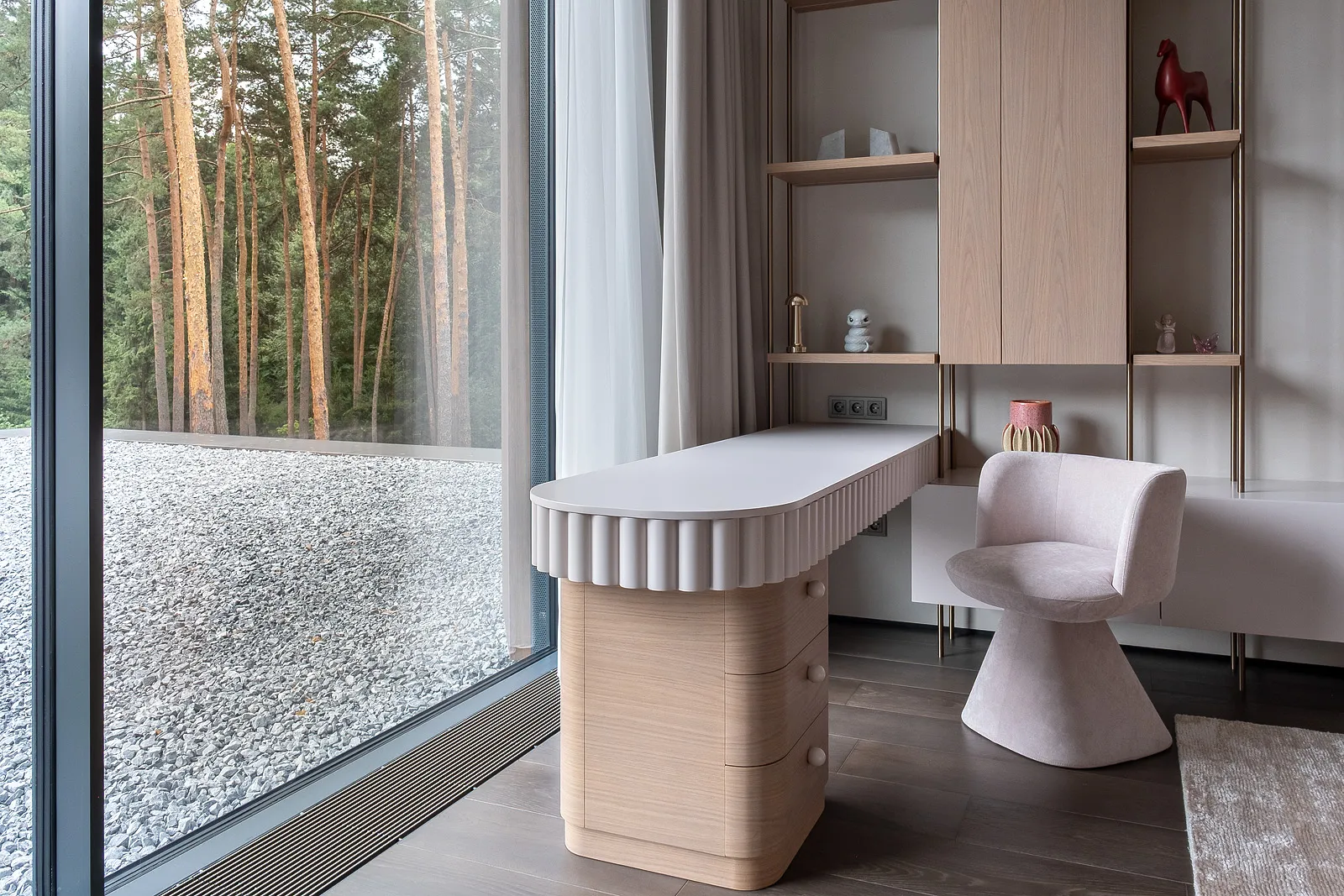
A built-in light-oak shelving unit on brass supports holds books and small objects without crowding the wall next to the window — another "quiet backdrop" move. Light oak was not an arbitrary choice: dark wood on the same wall would carry a visual weight comparable to the forest mass outside, and the two would compete for attention. Pale wood stays light and nearly dissolves against pale walls, leaving the compositional weight outside.
A desk that follows the same rule too
A fluted-front desk sits flush against the window — a choice that could easily have gone another way, since many projects turn a desk away from a good view to avoid distraction. Here the view won: even at the desk, the foreground is the forest beyond the glass, not the furniture, and the fluted texture stays restrained enough not to compete up close.
- Every material judged by one test — does it visually conflict with the window view at any time of day
- Warm, not cold, neutrality — mustard and terracotta extend the forest’s colour instead of opposing it with grey
- Light wood instead of dark — avoids a second heavy visual mass next to the forest outside
- Desk and bed placed at the window, not with their backs to it — the view is built into how the room is used, not pushed outside it
How the project evolved from the first site visit to the final sketch
The first site visit happened before the walls went up, when only the foundation layout and the actual pines around it were visible — it was at this stage that the decision was made to make the children’s room window full-height rather than the standard size in the original house plan. That window decision came before any furniture decision and effectively predetermined the whole material logic for the room.
What a more obvious approach would have lost
A literal reading of "do not compete with the view" — stripping out colour and texture entirely, white walls and grey furniture — would have produced something cold and faceless, not quiet. The gap between "quiet" and "empty" is that a quiet backdrop still has its own character, just tuned to resonate with what is outside rather than oppose it.
Technical details invisible in a photo
The mustard velvet headboard was not chosen by colour alone — for a child’s bedroom, dense short-pile velvet cleans more easily than a long-pile equivalent and barely builds static, noticeable in dry winter heating air. The bolsters are removable — unusual for this shape, but it means cleaning or replacing just them without touching the main upholstery.
The shelving unit’s brass supports are not a decorative photo detail but a functional choice — brass does not rust in humidity, which runs higher than in the city near a forest, with day-night temperature swings. The support material was dictated by the site’s climate as much as by looks.
Why this is not simply "minimalism"
It is easy to confuse "furniture as a quiet backdrop" with minimalism in the usual sense — bare surfaces, no colour. The difference is fundamental: minimalism usually builds from the room’s own internal logic, while here the starting point is what happens outside the window, and the whole interior palette answers to that external reference rather than an abstract idea of simplicity. That is exactly why the project includes saturated mustard and terracotta — a minimalist scheme would almost certainly have excluded both.
What the clients said after moving in
Feedback after a few months living there: the "quiet backdrop" effect works most strongly in the evening, when sunset light through the pines lands on the mustard velvet in almost the same hue — the line between room and view blurs literally by colour, not just composition. By day, under more neutral light, the furniture reads on its own but still does not clash, thanks to the shared warm palette.
What the clients changed from the first sketch
The first sketch for the children’s bedroom proposed a calmer, almost grey headboard tone — closer to the "safe" neutral default easiest to propose for a "do not compete with the view" brief. It was the clients, during approval, who asked to try a warmer option after seeing the mustard velvet swatch next to photos of the view at different times of day — their edit, not the designer’s original idea, decided the final colour.
A common, if rarely mentioned, part of the process: the best solution in a bespoke project is not always born fully formed at the designer’s desk — it is refined in dialogue with the people who will live in that room daily and sense their home’s light nuances more precisely than any single site photo can convey.
Can this approach work without a forest outside
The "furniture as a quiet backdrop" principle does not require a forest specifically — it requires any strong focal point worth yielding attention to: a city panorama, a feature wall, a fireplace, a large artwork. The colour and texture logic stays the same: interior materials should resonate with that point’s colour temperature rather than compete with it in brightness or contrast.
A note from a KALLEN HOME designer
"The most common mistake in such projects is to fear a strong view and default to white and grey just to stay out of the way. The result is not quiet, it is empty. For the House in the Forest we looked not for an absence of colour, but a colour that sings in the same key as the forest at different times of day," says the KALLEN HOME designer who worked on the project.
He says the final check was simple: photograph the room at sunset and in the morning and see whether the furniture "argues" with the changing light in either case — a solution that passed both times of day was approved for good.
For the studio itself, this project remains an example of how a brief’s constraint — "do not compete with the view" — does not narrow the options but sharpens the criterion for picking between them: instead of endlessly sorting through colours and textures, every candidate gets checked against one question, and most fall away immediately, leaving only the few that actually work.
Details the clients asked to repeat in other rooms of the house
After the bedroom solution was approved and built, the clients asked to repeat the "quiet backdrop" principle in the ground-floor study, where a window faces the same forest from another side of the plot. There the palette was adapted for the room’s more evening-heavy use, keeping the same warm colour logic but shifting it toward walnut rather than mustard tones.
Reusing one principle across several rooms in the same house is standard practice in bespoke projects — once a material logic proves itself in one room, scaling it to neighbouring rooms is simpler and cheaper than inventing a new concept for each one from scratch.
The key is transferring the principle, not copying the solution verbatim — colour and material are re-chosen each time for that specific room’s light and purpose, or a house risks becoming a set of identical interiors instead of related but distinct spaces.
That is why the study did not literally repeat the mustard velvet or the headboard shape — it took only the idea of a warm palette resonating with the forest and matched it with its own separate set of materials, fitting a workroom rather than a bedroom.
How long this specific project took
About four months passed from the first site visit to the final furniture placement in the children’s bedroom — a span including not just furniture-making but waiting for wall finishing and flooring, without which placing final pieces made no sense. The furniture itself — headboard, shelving, desk — took roughly six to seven weeks within that span, in line with the usual timeline for bespoke furniture of this complexity.
What to take from this case for your own project
- Define the room’s main focus before choosing furniture — a view, a fireplace, a feature wall — and let materials answer to it
- Look not for an absence of colour but for a colour resonating in temperature with that main focus
- Test chosen materials under different light — morning and evening, not just daytime in a showroom
- Do not be afraid to revise a sketch after the first version — the best solution sometimes comes in the second or third round
See the House in the Forest project
Frequently asked questions
What is the floor area of the House in the Forest project?
240 sqm, in the Moscow region, standing at the edge of a pine forest.
Why was mustard velvet chosen over neutral grey for the bedroom?
Warm mustard extends the forest’s colour logic outside, while cool grey would have created a visual contrast and conflict with the view.
Why was the desk placed right at the window, not with its back to it?
So the view stays part of the room’s daily use everywhere, including at the desk, not just from the sofa or bed.
Can a similar approach work in an apartment without a forest view?
Yes, the "furniture as a quiet backdrop" principle works with any strong view or focal point — a city panorama, a fireplace, a feature wall.
How was it checked that the furniture colours did not clash with the view?
By photographing the room at sunset and in the morning and checking the furniture did not clash with the changing light in either case.