In a high-floor apartment at ZhK Life-Kutuzovsky, the panorama became part of the interior, not a backdrop: the table sits right at the window, materials were chosen not to compete with the view, and the chandelier holds the light without blocking it from any point in the room.
The brief: the view matters more than decor
The 148 sqm apartment occupies a high floor at the Life-Kutuzovsky residential complex in Moscow, completed in 2022. The brief was simple: the city panorama from the dining area’s windows should stay the room’s main impression at any hour, with the dining group working alongside that view rather than competing for attention.
In practice this meant two things at once: the table’s position had to physically use the window rather than tuck the dining zone deeper into the room, where the view becomes a partial backdrop. And the materials had to read as premium and confident in their own right, but without contrast loud enough to pull the eye from the glass toward the furniture.
Why the table sits right at the window, not deeper in the room
The most common mistake when arranging a dining zone with a good view is centring the table "for symmetry," leaving a walkway or decorative buffer between furniture and window. This apartment rejected that — the table sits as close to the glass as possible, so the panorama becomes almost a continuation of the tabletop rather than a framed picture off to one side.
There is a practical side too: on a high floor with no buildings crowding the window, the risk of direct-sun overheating through the glass is lower than it looks, so people at the table are not squinting into bright light most of the day — something checked against window orientation at the planning stage, not guessed afterward.
Black marble on a sculptural gilded base
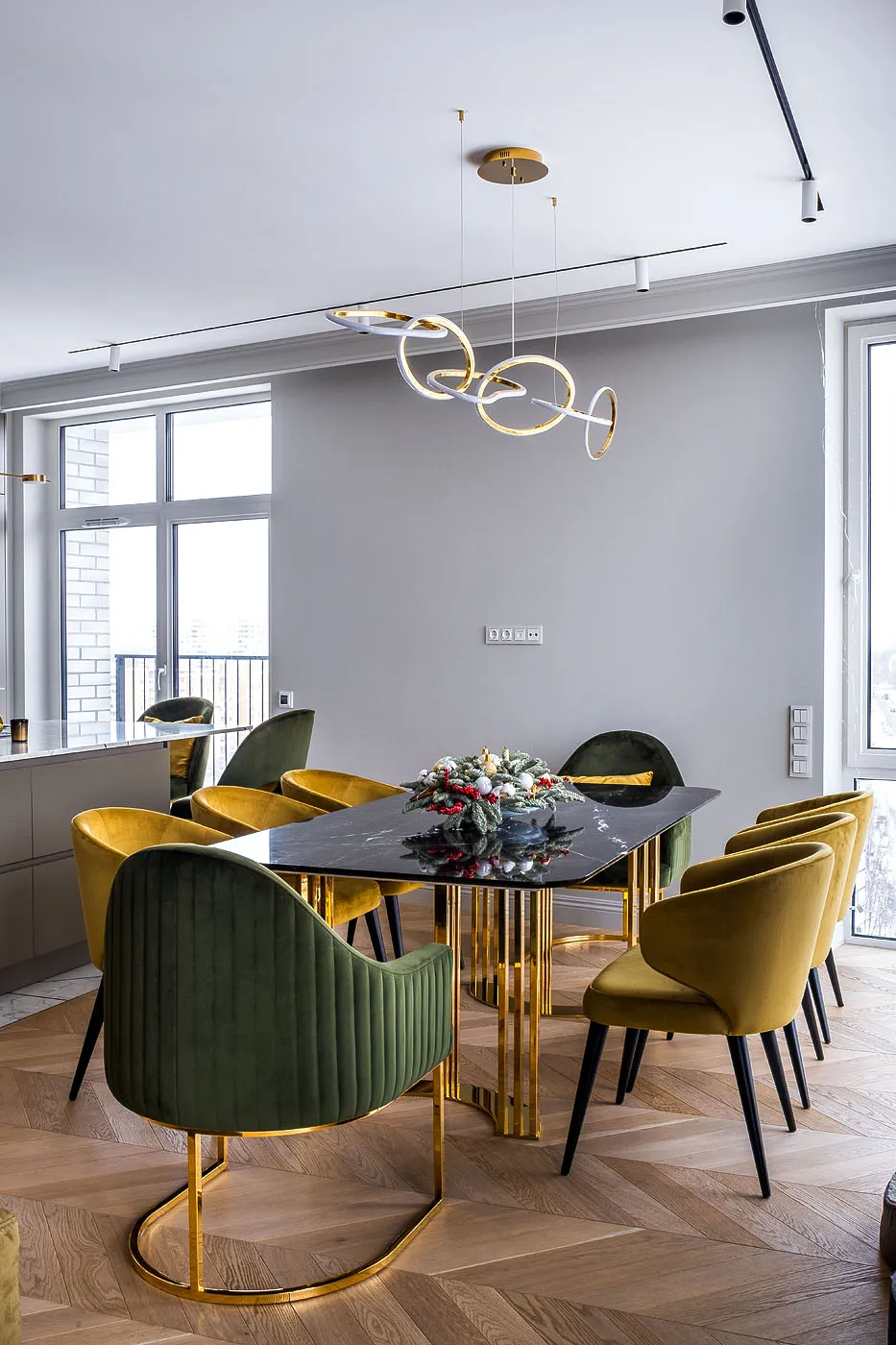
The tabletop is black marble — a material that behaves differently in daylight by the window than in a shaded part of the room, with reflections of sky and window adding depth, literally weaving the view into the furniture’s surface. The sculptural, gilded base deliberately contrasts with the dark stone in colour but not in character — both materials read as premium and calm, with no abrupt shapes to distract.
Choosing marble over porcelain stoneware or another practical alternative makes sense here because the table serves family gatherings, not daily food prep directly on the surface — marble’s porosity, which calls for care around acidic liquids, matters less than its unique, never-repeating vein pattern.
Two velvet tones instead of one
The chairs around the table are upholstered in two velvet tones — olive and mustard — rather than one uniform colour, as is more common for formal dining sets. Alternating two close-but-different warm tones creates a subtle variation around the table — the seating does not read as a generic "table plus ten identical chairs" set, but as a more personal, lived-in composition.
- Both velvet tones are warm in colour temperature — neither creates a cold contrast with the table’s gilded base
- Alternation, not random mixing — chairs follow a deliberate pattern around the table, not an arbitrary one
- Velvet gives colour depth under different light — by the window in daylight and under the chandelier at night, the tones read differently but equally well
- Two tones rather than one reduce the risk of the seating feeling hotel-uniform
Seating for ten: how the count was decided
A dining group’s seat count is almost never set "just in case" without a reason — here, ten seats reflect how often the family gathers in full, including regular guests, not just a big holiday meal a few times a year. That usage pattern differs from a "holiday table once a year" scenario, where a more compact set with extra chairs brought in for rare occasions would make more sense.
The brass-ring chandelier: light that does not block the view
The chandelier is built from interlocking brass rings, hung to hold even light exactly over the table without blocking the panorama as seen from the doorway — not a lucky accident, but the result of checking the fixture’s height and position against several sightlines at the sketch stage, before installation. Brass was also a practical choice: the metal resists corrosion from humidity swings near a large glazed window, which can run higher there than in the rest of the room.
What a more obvious choice would have cost
The most intuitive choice for this room would be a classic single-drop central chandelier and chairs in one colour around the table. That would have worked, but turned the dining zone into its own compositional centre competing with the window, rather than a partner to the view outside. The difference between "a nicely finished interior" and "an interior that works with this specific apartment" often comes down to exactly this level — not expensive materials for their own sake, but whether they serve the room’s actual brief.
Technical details invisible in a photo
A marble top this size carries real weight, which has to be factored into the base design, especially on a high floor where floor loading is checked in advance, not after the fact. The sculptural metal base is engineered to spread that weight evenly across four contact points rather than concentrating it in one narrow spot that could dent the flooring over time.
Wiring for the brass-ring chandelier was also planned ahead, not improvised on site — the ceiling mounting point depended on the table’s final position, which depended on the window, so electrical layout was agreed at the furniture-sketch stage, before the ceiling finish went in. Moving the fixture’s mounting point after the ceiling was finished would have cost far more in both time and money.
Why furniture was planned alongside the renovation, not after it
A common practice is to finish the renovation fully and only then arrange furniture. That order would not have worked here: outlet positions under the chandelier, wiring for window-side lighting, and even the final flooring thickness by the window all depended on exactly where the table would stand and how much weight it would bear. The dining group’s sketch was therefore prepared alongside the renovation plan, not after the flat was finished.
This parallel process demands more coordination upfront — builders and furniture makers need to sync drawings before finishing work starts, rather than adjusting one to the other afterward. In exchange, it saves time at the end: no need to open up finished walls for a relocated outlet or trim already-laid parquet for a table base that turned out wider than planned.
The client’s feedback a year after moving in
A year after the project finished, the clients noted the window-side dining area had become a place the family spends noticeably more time in than in their previous flat — partly because the view changes through the day and holds attention longer than an interior lacking that natural source of change. They said the evening gatherings at this table, as the city lights up outside and the brass chandelier adds warm light from above, became the one detail hardest to picture from drawings alone during approval.
A note from a KALLEN HOME designer
"On high floors with a good view, the biggest mistake is being too timid with it — small furniture pushed to the edges. We deliberately checked the chandelier’s height against several sightlines at the sketch stage, precisely to avoid redoing the installation later," says the KALLEN HOME designer who worked on the project.
By his account, checking the furniture sketch and lighting plan together before installation — not after — is usually what saves such projects from a chandelier that photographs beautifully but sits exactly on the doorway-to-window sightline, visually slicing the panorama in half.
How the approach would adapt to a different table shape
The rectangular table shape here is deliberate: seating ten right at the window, a straight line echoes the glazing line better than a round or oval table of the same capacity, which would eat more of the room’s depth and push some guests further from the window than others. In a square rather than elongated room, the same "table at the glass" principle would call for a round or oval shape instead — the placement logic stays, only the table’s shape adapts to the room’s proportions.
What would differ without accounting for the view
Had the brief ignored the view — a standard dining group placed by ergonomic rules alone, without discussing the window at the brief stage — the result would likely have been technically correct but far less memorable: the table nearer the room’s centre, the chandelier on the ceiling’s symmetry axis, and material choices driven by the season’s fashion rather than this specific apartment’s specific light at a specific hour.
The real difference is not budget or execution complexity — a similarly priced set of materials could be arranged in an ordinary, less considered way. The difference is that here every decision, from the table’s position to the chandelier’s height, was checked against the same question — does it help the view or hinder it — and that discipline, not the mere use of marble and brass, sets this project apart from a typical one.
Timeline and stages
About eight weeks passed from sketch approval to final installation in the Kutuzovsky apartment — typical for a set combining a table on a bespoke base with ten chairs in two fabrics, where matching the velvet tones to each other and to the room’s palette takes more attention than the mechanical assembly itself.
Nearly two of those eight weeks went into matching the two velvet tones to each other and to the gilded base — fabric samples were brought to the apartment and viewed in natural light through that exact window at different times of day, not just under showroom lamps, since daylight through glazing this size turned out to be the decisive factor for how the colour actually read.
The rest of the time split almost evenly between making the table on its bespoke base and hand-upholstering the ten chairs — both ran in parallel rather than sequentially, which is what kept the project to eight weeks instead of three or four months had each stage waited for the one before it.
This project stays in the portfolio as an example that "working with the view" is not a marketing phrase but a concrete, step-by-step checkable process — from the table’s position and the chandelier’s shape to what light falls on a velvet swatch at three in the afternoon by that exact window.
For clients now considering a similar apartment with a good view, the takeaway is simple: discuss the view with the designer and furniture maker at the very first meeting, not once renovation drawings are already finished — that is when the solution still has enough freedom for the panorama to become part of the interior, not just a nice bonus behind the glass.
This case is not really about marble or brass — either material could be swapped for another in a similar price range without losing the core idea. It is about the habit of checking every decision against the same question throughout a project, not just at the concept-approval stage — that habit, not the specific material list, is the real takeaway here.
See the “Life-Kutuzovsky” project
Frequently asked questions
Why was a marble top chosen specifically?
Marble carries a premium feel and a unique, never-repeating vein pattern — for a table used for gatherings rather than daily food prep, that matters more than porcelain stoneware’s practicality.
How was seating for ten calculated?
Based on how often the client’s family gathers in full — regularly, not just once a year for a holiday.
Why do the chairs use two velvet tones instead of one?
Alternating close, warm tones makes the seating feel livelier and more personal, avoiding a generic hotel-set look.
Can a similar dining group be ordered around my own table?
Yes, chairs and bases can be adapted to an existing table or designed as a matching set for the required number of seats.
How long did the project take?
About eight weeks from sketch to installation, with extra attention to matching the two velvet tones to each other.
Why was furniture planned during the renovation, not after it?
Because outlet positions, chandelier wiring and floor thickness by the window depended on the table’s final position and weight — cheaper and faster to plan ahead than to redo finished work later.