A 165 sqm Moscow apartment faced a brief that sounds simple but is rarely pulled off: formal enough for an evening with guests, livable enough for an ordinary Tuesday. Cream velvet and leather, brass, and a coffered ceiling with cove lighting are the specific answer, not just a list of expensive materials.
Why we chose this project to close the year
Of all the interiors completed this year, the Fort Kutuzovsky apartment best shows how different materials — velvet, leather, brass, mirrored lacquer — can work together without feeling overloaded. Art deco as a style slides easily into excess — too much shine, too much contrast, too many accents at once. This project is interesting precisely for having excess where it belongs and restraint where it belongs too.
Floor area and layout as the starting point
165 sqm is enough for formal entertaining, but not so vast that separate halls could be carelessly assigned to every function, as in larger residences. That constraint disciplined the layout — the living room and dining area share one space with no walls, which is exactly why their material treatment had to read as one composition, not two different rooms that happened to end up side by side.
The brief: formality without losing the sense of home
The clients phrased the brief almost like an aphorism — "an apartment we are not embarrassed to host a hundred people in, and that we still want to curl up in alone to watch TV." That sounded contradictory at the start — formality and cosiness usually pull design in opposite directions — but finding the balance between them became the project’s central task, not a side detail.
The living room: restrained colour, expressive texture
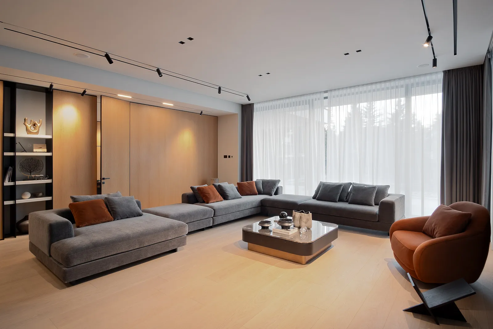
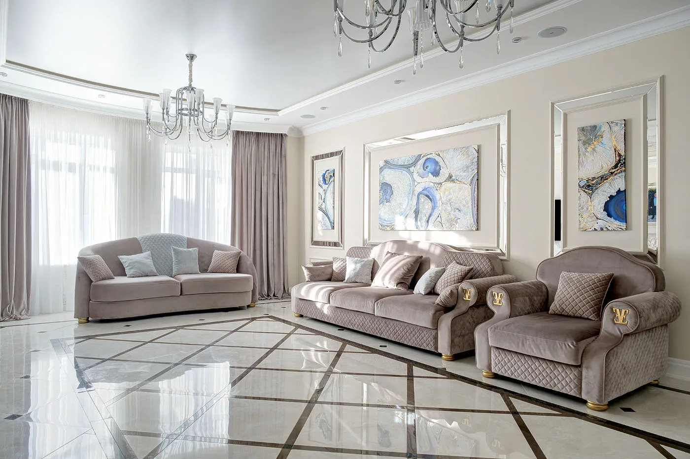
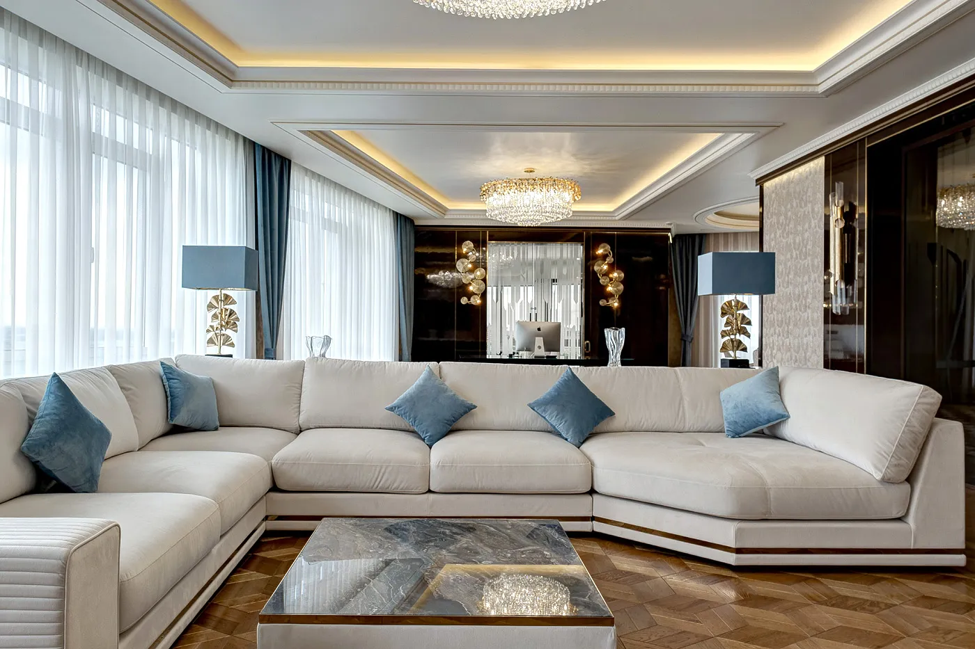
A cream velvet-and-leather sofa with dusty-blue cushions stands against dark lacquered mirror panels — herringbone parquet carries a warm tone across the room, balancing the mirrors’ cool shine. Combining velvet and leather on one sofa is not decoration but function — velvet on the back and cushions gives warmth and softness to the silhouette, leather on the seat and armrests takes the daily wear and cleans up more easily.
The dusty-blue cushions are the room’s one genuinely cool colour accent, introduced deliberately so the cream palette does not go flat — without that single cool note, the room would read as one unbroken warm tone with no internal dialogue between shades.
Mirrored panels: a risk solved through zoning
Dark mirrored lacquer on the panels behind the sofa is a material that easily "chills" a room visually and feels less cosy in excess. The fix was confining the mirror finish to just that backdrop zone, not extending it to neighbouring walls, and offsetting its cool shine with warm herringbone parquet across the whole floor — mirrors working from above, warm wood from below.
The dining area: brass and crystal as one material conversation
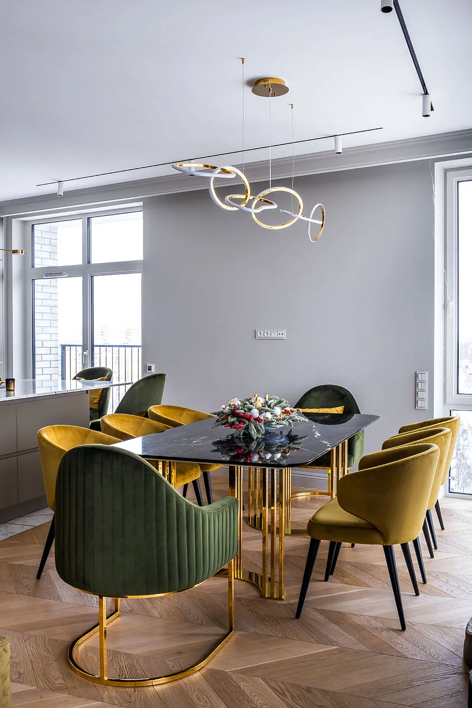
A round table on a brass base is surrounded by quilted armchairs on black, brass-capped legs, while a cascade of round crystal chandeliers above continues the brass theme set by the table base and leg caps. The round shape was not only aesthetic — at a round table there is no "head" seat, better matching the informal-yet-formal character of evenings the owners had in mind.
Repeating brass across three different pieces — the table base, the chair-leg caps and the chandelier cascade — keeps the dining area cohesive without ornament: the eye reads one material repeated at different points as a single composition, not three coincidentally matching pieces.
The ceiling that holds the whole look together
A coffered ceiling with hidden cove lighting and glossy brass-patterned panels are the final touch that makes the space formal without it stopping being a home. The hidden cove lighting gives a diffused, slightly theatrical glow in the evening, but by day, under natural window light, the same ceiling geometry reads calm and understated — that dual reading of one construction is exactly why a coffered ceiling was chosen over a flat one.
The entryway: the first impression was not left modest
For an apartment meant to impress from the doorstep, the entryway could not stay neutral transit space — this is where a guest forms their first impression before even seeing the living room. The answer was a mirrored console on brass legs and dark, saturated wall finish, contrasting with the lighter living room further down the hall and working as a visual overture before the apartment’s main space.
The study: the same material language, in a quieter register
The owner’s study continues the living room’s palette — warm wood, brass hardware details — but without the mirrored lacquer or crystal, which would be excessive in a room meant for focused work rather than hosting. It shows how one project’s material language can sound different in rooms with different purposes without losing the whole home’s cohesion.
The bedroom: the one room that fully departed from art deco
Unlike the other rooms, the clients asked for the bedroom to stay deliberately simple with no strong stylistic gesture — soft neutral-toned textiles, minimal metal and shine, warm light with no contrast. The decision deliberately works against the "whole house, one style" logic — here the bedroom acts as a contrasting pause after the saturated formal rooms, not their continuation.
Lighting throughout the flat: scenarios, not just brightness
In every formal room, lighting was planned not as one brightness level but at least two scenarios — bright for everyday tasks, dim and warm for evening hosting, controlled independently. Without that split, the coffered ceiling and brass details would look striking only in a staged photoshoot, not in the apartment’s actual day-to-day life.
What took longest to settle at the sketch stage
By the team’s account, the longest negotiation was not over furniture shape but the ratio of mirrored lacquer to the rest of the living room’s surfaces — how much wall should be mirrored backdrop versus left to warm parquet and textile. The first sketch had mirror panels across nearly the whole wall; only a scale mock-up showed this overloaded the room with cold shine, and the solution was cut back to one local zone behind the sofa.
The engineering side: what hides behind the coffered ceiling
The coffered ceiling with hidden lighting was also an engineering task, not just a design choice — each coffer carries its own lighting line with its own dimmer, and the coffers’ depth is calculated to hide the light source from direct view at any angle in the room, not just the centre. Calculating that depth took a separate design iteration, since too shallow a coffer exposes the bulb, and too deep one visually weighs down the ceiling and steals room height.
The formal living room’s acoustics: an easy detail to miss
Mirrored lacquer, glossy ceiling panels and stone console surfaces together make a noticeably more reflective, echoey space than a room dominated by soft textiles and rugs. To keep a crowded evening from turning into a hum of reflected voices, heavy window drapes and the quilted armchair upholstery were deliberately tasked with sound absorption that nothing else in this room could take on — no large rug or soft walls were part of the design.
Storage: the invisible part of a formal look
A formal space with no visible clutter needs deliberate storage for exactly what usually piles up on open surfaces — remotes, chargers, papers. The console under the hallway mirror and hidden drawers under the armchair seats provide exactly that, designed at the furniture-sketch stage, not bolted on afterward once it became clear objects had nowhere else to go.
Seasonal textiles: how the formal living room changes summer and winter
For winter, a denser, darker throw on the sofa and candles on the dining table reinforce brass’s warm light through short days; summer brings lighter, airier textiles that ease the visual weight of mirrors and velvet under longer, brighter daylight. This seasonal shift changes only the textile layer, not the interior’s structure — exactly the layer easiest and cheapest to adjust without touching the core furniture.
Why this project was chosen to close the year, not just sit as one case among others
The main selection criterion was not budget or floor area but the skill of combining materials with contrasting character in one space without losing the sense of home. Most art-deco interiors seen in other studios’ portfolios either overdo the shine or tone the style down so much it stops reading as art deco at all. This project found the middle ground, and that middle ground is rare enough to deserve a year-end spotlight.
The clients’ feedback after several years living there
The project was completed in 2021, and after several years of active use the clients note the sofa’s leather section has held up noticeably better than expected — thanks to zoning leather and velvet by wear load, not aesthetics alone. By their account, that practical detail hidden behind the striking look is the one they are more grateful for years later than for the room’s appearance itself.
A note from a KALLEN HOME designer
"Art deco forgives boldness in details but not boldness everywhere at once. We deliberately left only three genuinely bold material gestures in this apartment — velvet-and-leather, brass, and the coffered ceiling — and let them speak one at a time, not all together," says the KALLEN HOME designer who worked on the project.
By his account, this exact rule — no more than three genuinely loud material statements per space — is one he now consciously carries into other projects regardless of style, a rule born from working on this specific apartment, not planned in advance as a theoretical concept.
What would change if the project were done again
Asked directly what the team would change after a few years watching the apartment in real use, the answer was specific — they would have planned a removable protective cover for the sofa’s leather section for children’s parties, a scenario the family had not yet planned for at the design stage, only emerging after the project was delivered.
A lesson for similar projects: scenario flexibility beats a perfect static picture
The main practical lesson from this case for similar formal interiors is building in flexibility for scenarios not yet obvious at the design stage, not just the client’s current lifestyle. A family, children, pets, a career shift to remote work — any of these can change furniture requirements more than a passing design trend, and a sensible project leaves room for that rather than locking the apartment forever into one moment in life.
Why this project was chosen to close the year, not just sit in the portfolio
Of dozens of interiors completed this year, this one was picked for the year-end breakdown not because it is the largest or most expensive in materials — the portfolio has plenty of those. It was picked because, after several years of living there, it is clear which decisions actually worked in practice and which stayed beautiful but did not fully pass the test of time — an honest retrospective rarely possible for a project delivered just yesterday.
For us as a workshop, it is also a rare chance to check our own predictions against reality — at the sketch stage, the team bet that zoning leather and velvet would prove not just a good-looking choice but a practical one, and years later that bet was confirmed by actual use, not just the handover photos.
See the “Fort Kutuzovsky” project
Frequently asked questions
How many materials were used in one space?
Four main ones — velvet, leather, brass and mirrored lacquer — united by one restrained palette, never more than three truly loud accents at once.
Does art deco suit a smaller apartment?
Yes, if one or two accent materials are chosen rather than all at once, as in this 165 sqm project.
Can this dining set be adapted to a different table?
Yes, the armchairs and table base can be individually adapted to the required size and material.
Why combine leather and velvet on one sofa instead of just one material?
Load-based zoning — leather on the seat and armrests takes the main wear and cleans easily, velvet on the back and cushions softens the silhouette.
Why were mirror panels limited to one zone, not the whole wall?
A full-wall mirror version visually overloaded the room with cold shine — cut back to a backdrop behind the sofa, offset by warm parquet elsewhere.