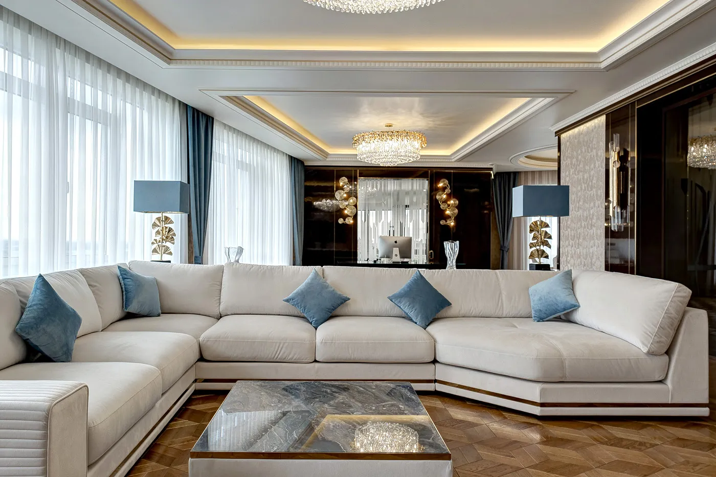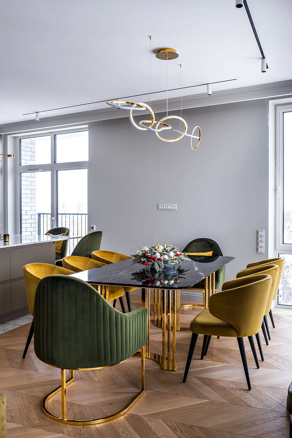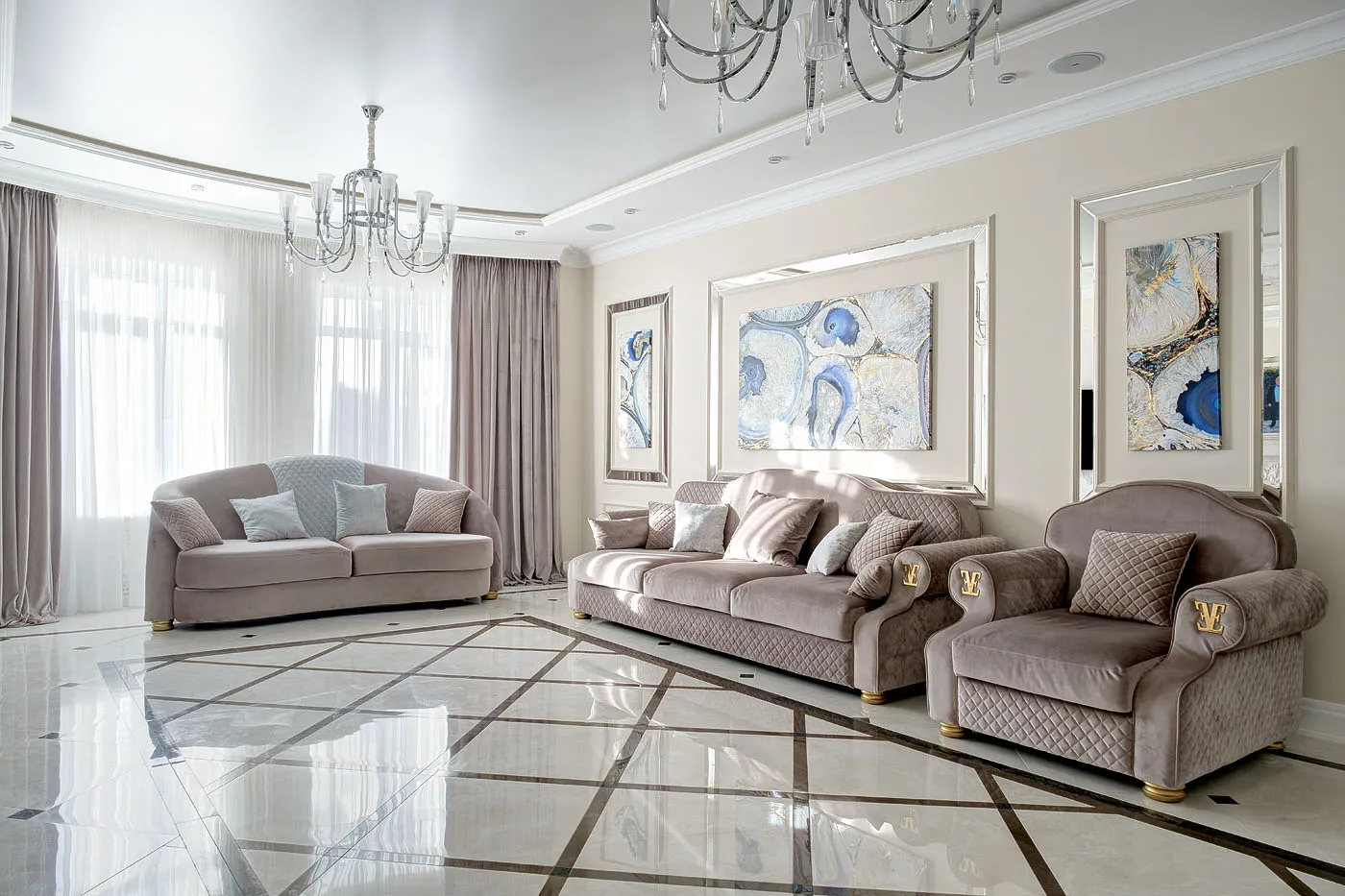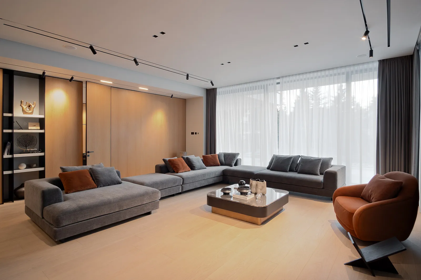
The clients wanted no sharp contrasts, but no empty feel either — the answer was texture, not colour: graphite velvet, bleached oak and terracotta accents repeating floor to floor.
The brief: restraint that does not read as emptiness
The brief sounded simple but held a built-in tension common to restrained interiors: no sharp contrast, yet the house must not feel empty or faceless. Purely neutral colour solves the first half and fails the second — the answer here was textural complexity within a related colour range, not colour contrast.
- Living-room corner sofa — graphite velvet
- Sofa accent cushions — terracotta textile
- Nearby sculptural-leg armchair — the same graphite tone
- Panel hiding service doors — bleached oak
- Shared-zone lighting — ceiling track, no overhead fixtures
The floor-by-floor plan as a first decision, not a formality
The 310 sqm house splits by function: the ground floor is one open shared zone — living room into kitchen and study — the upper floor holds private bedrooms. That split shaped the furniture logic: bold enough to hold an open-plan room’s scale downstairs, quiet enough to stay unnoticed upstairs.
Why graphite velvet, not a neutral grey
The living room’s corner sofa is graphite velvet, not a flat matte fabric in the same grey — flat grey on a smooth surface reads cold exactly where emptiness was the risk; the same tone on velvet’s short dense pile plays with light as someone moves through the room, looking different morning to evening, from the sofa or from the doorway.
Terracotta as a connecting colour, not an accent splash
Terracotta accent cushions on the graphite sofa are picked up by a sculptural-leg armchair nearby — the same tone repeated in a different piece at a different viewing distance. The goal is not to make an accent pop, but to tie two pieces together so the room reads as one composition, not scattered furniture — repetition, not contrast, does that job.
Bleached oak: one panel, two problems solved
A bleached-oak panel in the shared zone hides doors to service rooms — removing the visual noise of ordinary door leaves and frames breaking up the wall. Its light tone does not compete with the graphite furniture and terracotta accents, acting as a third neutral player rather than another colour vying for attention.
Light without overhead points: track lighting instead of chandeliers and spots
Ceiling track lighting replaces overhead fixtures entirely — used specifically to avoid breaking up the ceiling into scattered points from individual spotlights. One continuous track instead of a dozen recessed fittings keeps the ceiling whole, following the same restraint principle as the furniture: not less light, but less visual noise around it.
The hard part: restraint easily slides into dullness
The real risk in this brief is not colour but texture count: one restrained fabric across a whole house reads flat fast, while three or four related textures start to work as real composition. Here the texture range runs from velvet pile to smooth bleached wood to matte metal to soft cushion textile — four tactile impressions within two or three colours.
Kitchen and study: the same logic in working zones
The ground floor’s open plan means the kitchen and study are visible from the living room almost constantly, not hidden behind a door — so the textural logic had to continue there too. The study repeats the same bleached oak, now as a working desktop rather than a decorative plane; matte kitchen fronts in the same warm, non-contrasting tone carry the same "connection through material, not colour-accent" logic.
Why velvet, not wool, for a corner sofa this size
Wool was considered as the more durable option for a large, high-traffic corner sofa, but its flatter, more uniform surface fought the "not empty" half of the brief on such a large upholstered area — an open-plan corner sofa occupies a real share of the field of view, and a flat, neutral surface there reads unfinished. Velvet’s shifting light does the visual work on its own, without added pattern.
How many rounds the graphite shade took to settle
The final graphite shade was not approved on the first swatch — two early options looked convincing in showroom daylight but read either too cold or too dark against the bleached oak under the living room’s actual warm evening light. The final choice came only after testing swatches on site, under real evening light — the same principle we recommend to every client choosing fabric.
The hardest technical part
The hardest technical part was not the sofa or armchair but matching the same terracotta across different textiles — dense ground-floor cushions and softer, more draped bedroom accents upstairs. The same pigment visually "sits" differently on fabrics of different density, requiring an extra round of swatch-matching rather than simply ordering "the same colour" by catalogue number.
The upper floor: the same logic, quieter
Upstairs, the same palette and texture logic continue at lower volume — the same warm wood tones without sculptural accents, the same terracotta in soft bedroom textile rather than a statement armchair. The house reads as one continuous space, but the bedroom never competes in expressiveness with the living room where guests gather.
- Shared zones carry bolder texture, private zones quieter
- One repeating colour across two pieces ties a room together without contrast
- Variety should come through material texture, not palette brightness
- Lighting without overhead points keeps the ceiling whole, not fragmented
What transfers to a flat with no separate floor
The "shared zone louder, private zone quieter" principle works in a flat with no stairs too — living areas carry bolder texture and richer (not contrasting) colour, the bedroom repeats the same palette in softer materials. The connecting-colour trick also transfers: two pieces of furniture in the same tone across different rooms is enough to read as one coherent space.
A note from a KALLEN HOME designer
"The hardest part of such a project is resisting ‘one more bright accent to liven it up’ — that is what usually ruins a restrained interior at the final stage. In Nikolino, if a texture already chosen could carry the liveliness, we did not add a new colour just for contrast," says the KALLEN HOME designer who worked on the project.
The project was completed in 2025 — by handover, both halves of the brief were solved by the same set of moves: colour repetition instead of contrast, texture variety instead of palette variety, and a clear volume split between shared and private zones.
The armchair’s sculptural leg — a detail holding the whole composition
The armchair beside the sofa stands on one central sculptural leg instead of four — in a no-contrast brief, this becomes the room’s one genuinely "architectural" accent. A single base takes less floor footprint and visually lifts the piece, so even dense graphite upholstery reads sculptural rather than heavy.
Why the furniture was not copied straight from the catalogue
Some pieces here are adaptations of existing KALLEN HOME catalogue models in size and fabric, not ground-up designs — standard practice that speeds production without losing individuality, since fabric, colour and proportion, not the base construction, are what make a piece feel bespoke. The construction base was proven and ready; colour, texture and exact sizing for this living room’s niche were worked out for this project specifically.
Why the house was not furnished more densely
At 310 sqm it would have been easy to add more pieces — a pouf, a second seating area — and many houses this size fill the space with quantity. Here the opposite logic was chosen: real empty space around the sofa and armchair group, so it is clear these few pieces are the point, not lost among a dozen others.
How the clients responded to the result
According to the project manager, the clients’ main comment after moving in was not about one piece of furniture but the overall feel — the house read as neither a showroom nor unfinished, exactly the middle ground the brief asked for. No single complaint or single rave about one detail, just an even impression of the whole space, is usually the sign a restrained brief was solved correctly.
What this project says about "no contrast" briefs generally
The "no sharp contrast" request comes up often in the workshop’s practice, and Nikolino is a good example that this phrase almost never means a wish for a boring result — clients usually fear not restraint itself but a bold colour combination they might regret living with for years. The answer is not to drop expressiveness, but to move it from colour into texture.
For anyone considering a similar project, the practical takeaway is simple: at the first meeting, state the fear behind the ban ("I don’t want to fall out of love with a bold sofa in a year"), not just the ban itself ("no colour") — the right answer comes faster than guessing through a stack of swatches.
The house was deliberately photographed both by day and in the evening with the track lighting on — the evening shot is usually what convinces a skeptical client that no overhead light does not mean dim, but a softer, more gathered atmosphere hard to judge from a daytime photo alone.
The project video for the Nikolino gallery deliberately includes a few seconds of exactly that evening transition — daylight to warm track glow — because a still photo cannot carry it, and it may matter more to understanding a restrained-but-not-empty house than any static room shot.
The full gallery, floor plan and video are on the project’s own page, including shots not used here — the kitchen, study and whole upper floor, not just the living room this piece centres on.
Frequently asked questions
How long did the project for a 310 sqm house take?
Timelines for the furniture scope are individual for a project of this size — they are discussed at the briefing stage.
Was a ready collection used, or was the furniture designed from scratch?
Some pieces are catalog models adapted to the required size and fabric, others are bespoke solutions for specific niches and openings.
Can I see more photos of this project?
Yes, the full gallery and video are on the "Nikolino" project page.
Can this approach work without two floors?
Yes, the "shared zone bolder, private zone quieter" principle and the connecting colour between rooms work in any flat.
What year was the project completed?
2025.