The 2022-built house in the Veshki settlement was conceived as a formal enfilade for hosting guests — intimacy was never the brief, and the furniture had to hold a 420 sqm hall’s scale while still feeling livable. Here is how that apparent contradiction was resolved.
A brief with no room for intimacy
Most residential projects start with a request for cosy, homey warmth — the Veshki brief read differently: the clients stated outright that the house was meant for regularly hosting a wide circle of guests, and intimacy, usually the default goal for a private home, was not part of the task at all. This immediately changes furniture logic — scale and presence had to come first, not hide behind "homeliness."
A room built for a wide circle of guests: the enfilade as a solution
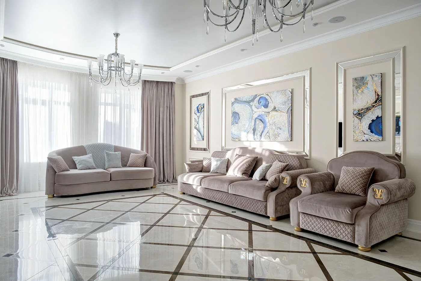
A hall lined with floor-to-ceiling mirrors opens straight into the living room, where a bay window rises behind the sofas — the enfilade layout was chosen not as a stylistic gesture but a functional one: a guest entering the house should feel the reception’s scale immediately, not walk down a narrow corridor to a small separate room for conversation. Every following decor and furniture element serves that same goal.
A 420 sqm floor area sets furniture makers a task opposite to the one usually solved in city flats — not "how to save centimetres" but "how to keep furniture from getting lost in the room’s volume, without turning the hall into a museum-like, unlived-in showcase."
Floor and ceiling: materials set before the furniture
The floor is polished marble with a dark stone inlay echoing the coffered plaster ceiling — both decisions were made before the sofa fabric, and the rest of the room’s palette was chosen to answer them. Stone of this scale sets a cool, formal tone from below, the coffered ceiling from above, and the furniture’s role in that structure became the warm, living middle layer that keeps people in the room rather than just passing through.
Quilted powder-grey velvet: why not just plain grey
The sofas and armchair are upholstered in quilted powder-grey velvet — a saturated but even tone that holds its own against the mirrors and crystal chandeliers in a room of this scale. Plain cool grey against marble and mirrors risked looking sterile; a saturated warm colour would have clashed too sharply with the stone floor. Powder-grey sits right between those extremes, with a faint pink undertone that warms under evening crystal light but stays restrained by day.
The quilted texture is a separate decision from colour — plain, smooth upholstery on furniture this large would have read flat against the textured coffered ceiling and stone floor, while a quilted pattern gives the furniture its own, if quiet, texture that holds attention as well as the room’s other materials.
- Polished marble with a dark inlay — a cool, formal tone from below, set before the fabric
- Coffered plaster ceiling — echoes the stone inlay pattern, holds the structure from above
- Quilted powder-grey velvet — a warm middle layer between stone and ceiling, its undertone shifting under evening light
- Paired mirror panels — amplify both daylight and evening light without adding fixtures
Light that works day and night
A pair of mirrored panels above the sofa doubles the bay window’s daylight, and in the evening the same surfaces gather the warm glow of the crystal pendants — the room keeps its reception-hall scale while staying livable precisely through this double duty of the same surfaces at different times of day. The solution also saves on fixture count, since the mirrors amplify existing light instead of needing extra wall lamps.
Why the furniture did not get lost in 420 sqm of space
The main risk for furniture in a room this large is visually drowning in the volume, leaving an empty, flat space around it. The fix was not more pieces but correct scale for each one — the sofas and armchair are large enough to hold proportion with the tall ceiling and bay window, yet spaced with enough air between them that the hall does not feel crowded and guests can move freely between conversation zones.
What a more modest approach would have lost
Had this been solved the standard city-apartment way — a compact sofa, a neutral practical fabric, minimal decorative gestures — the result would not have held the hall’s scale and would have read as a random add-on to the marble and plasterwork, not part of one unified concept. This is exactly why, for projects of this scale, furniture decisions are made alongside finishing decisions, not after them.
A note from a KALLEN HOME designer
"For halls this size, the biggest mistake is fearing the volume and shrinking the furniture to avoid 'overloading' the space. In practice, small furniture in a large hall looks even more lost than large furniture — we actually scaled the sofas up from typical city-apartment proportions," says the KALLEN HOME designer who worked on the project.
By his account, the main reference for proportions was not floor area but ceiling height and opening size — the bay window and coffered ceiling set the vertical scale, and the sofa’s back height and overall silhouette mass were fitted to that, not the other way round.
Can this principle be repeated in a smaller apartment
The principles — furniture scale relative to ceiling height and openings, material balancing the room’s cool and warm surfaces, light working day and night through the same elements — adapt to any floor area. In a flat with 2.7–3 m ceilings, that means a more compact sofa proportioned to that height, not a large one — but the same logic of sizing from architecture rather than a default catalogue size works at any scale.
- Set ceiling height and opening size before choosing furniture, not after
- Pick upholstery that resonates with, not fights, cool surfaces like stone and mirrors
- Scale furniture up, not down, from typical city proportions in a 400 sqm+ volume
How many sofas a hall this size actually needs
A separate question in halls of 400 sqm and up is whether to place one very large sofa or several smaller pieces arranged by zone. Veshki took the second path — the sofas and armchair form one composition by the bay window but stay separate pieces that can be rearranged for a specific scenario, an intimate chat for a few people in one corner or a general gathering by the main wall in another, with no need to walk around one monolithic corner block.
How furniture load was calculated for a formal hall
For a house that regularly hosts a wide circle of guests, not just a couple of times a year, fabric and frame durability are calculated toward the upper rather than average end of typical home norms — closer to figures used for public-space contract furniture, even though the sofa remains a residential, not hotel-grade, piece in appearance. That decision is made at the brief stage, not retrofitted after the first large reception.
Details invisible in a photo of the hall
The quilted stitching on the velvet here was done by hand to a custom template, not machine-run on a standard grid — on furniture this size, machine stitching would have shown noticeable diamond-pattern drift along the long sofa’s edges, visible precisely because of the furniture’s scale. Hand-adjusted stitch spacing at the armrests and corner sections is a detail a guest would not name, but one that decides whether the furniture reads as quality up close, not just from across the room.
How long the furniture stage of the project took
For a set of several sofas and an armchair in quilted velvet for a project this scale, the furniture stage took about ten weeks from approved sketch to final placement — noticeably longer than for one standard sofa, mainly because of hand-quilting on every section and the need to match velvet colour across the whole batch with no visible shade gap between pieces.
What the clients noted after two years of use
After two years of regular hosting, the owners noted that the even, unsaturated velvet colour proved the right call for the long run — a bright or contrasting fabric over this much upholstered area would tire the eye quickly with frequent use, while the powder-grey tone stays a backdrop that never grows tiresome to look at, reception after reception.
How the velvet’s durability was checked at the selection stage
For a hall hosting a wide circle of guests at once, the usual hand-feel swatch check was not enough — the workshop requested the supplier’s abrasion test report for this specific velvet batch, not the collection in general, and confirmed a rating above 30,000 Martindale cycles before including the fabric in the final quote. The same logic as any other heavily used project, just applied to a visually higher-end fabric sometimes mistakenly assumed to be decorative and therefore less practical.
A lesson for smaller-scale projects
Even outside the context of a 420 sqm formal hall, this case offers one specific habit to borrow: before ordering large furniture in an expressive fabric, ask not just "is this beautiful" but "what here is for restraint and what is for texture" — that balance between the two roles, not the choice of one striking material, decides whether an interior stays interesting years into use, not just in photos right after handover.
The armchair as a bridge between the sofas
In the furniture set, the armchair performs a function easy to miss in a photo — it does not literally repeat the sofas’ shape, but repeats their fabric and colour, acting as a bridge between two large pieces and the rest of the hall. This role is typical for reception spaces needing several conversation zones without the furniture reading as a randomly assembled set — fabric unity achieves this almost for free, with no need for a third identical sofa.
What Veshki says about coordinating with finishing contractors
Since the floor’s stone-inlay pattern and the ceiling’s plaster coffer pattern were coordinated with each other in advance, the furniture workshop had to sync its schedule with the stone-laying crew and the plasterwork crew — three separate contractors working to one agreed drawing, not adjusting after the fact independently. This organisational complexity is invisible in the finished interior, but without it the floor-and-ceiling pattern match simply would not have happened.
The case’s main point in one sentence
Boiled down to one idea, the case says this — for a formal space, furniture should not "compete for attention" with the architecture or the guests; its job is to hold scale while staying a backdrop that makes the reception itself possible, not its main character. That balance, not any single lucky detail like the stitching or the velvet shade, is why the Veshki hall works exactly as intended.
For anyone currently planning their own formal hall, the case offers a concrete sequence to borrow — decide floor and ceiling materials first, then furniture scale and shape from opening heights, and only last the specific fabric shade that reconciles the room’s already-chosen cool and warm surfaces, not the other way round.
This sequence runs opposite to how many people start a project on their own — usually picking a liked sofa from a photo first, then choosing floor and ceiling materials afterward to fit the furniture already bought. For large-scale formal spaces, that order almost guarantees a mismatch later patched over with decor, when it could have been avoided by simply getting the decision order right from the start.
The Veshki project stays in the portfolio as a reference point for similar orders — when a new client asks for "something similar in scale," the conversation starts not with literally repeating the velvet or mirrors, but with a question about ceiling and opening heights in their own home — the same first step this project itself once started from.
Frequently asked questions
What is the Veshki project’s floor area, and when was it completed?
420 sqm, the Veshki settlement near Moscow, residence category, completed in 2022.
Why was velvet chosen for a large hall instead of a tougher fabric?
Quilted velvet holds a saturated but even colour pairing with mirrors, crystal and marble without excess contrast, and the quilted texture gives the furniture its own presence against the textured ceiling.
Why is the furniture larger than typical city-apartment pieces?
Proportions were set by ceiling height and the bay window’s size, not floor area — small furniture would look more lost in a large volume than larger pieces.
Can a similar project be scaled down for a smaller apartment?
Yes, the principles — furniture scale relative to ceiling height, warm-cool material balance, light through the same elements day and night — adapt to any floor area and ceiling height.
Why were the floor and ceiling chosen before the furniture?
Because stone and plasterwork set the room’s cool, structural tone, to which the warm, living middle layer — furniture and fabric — was then fitted.