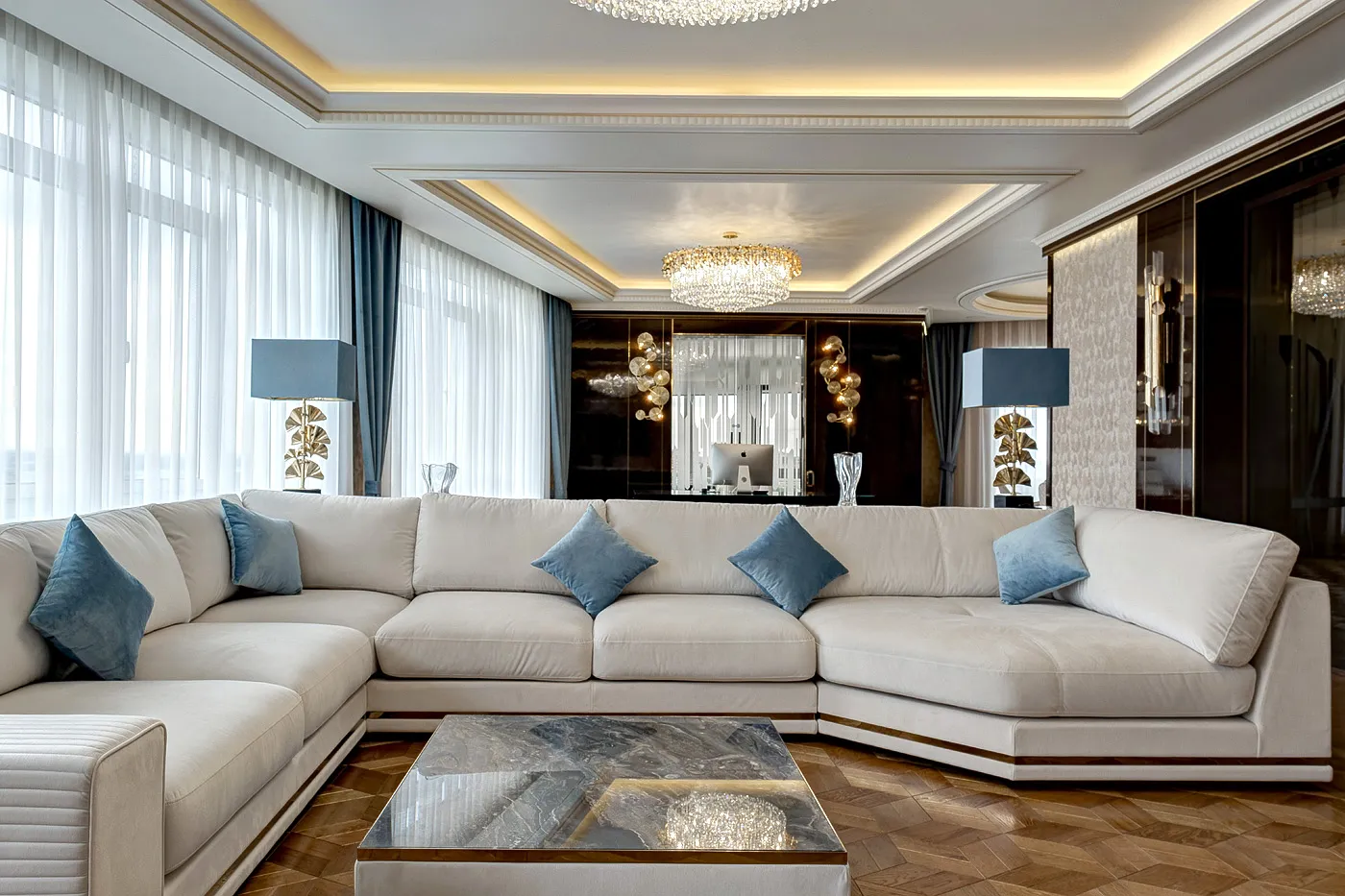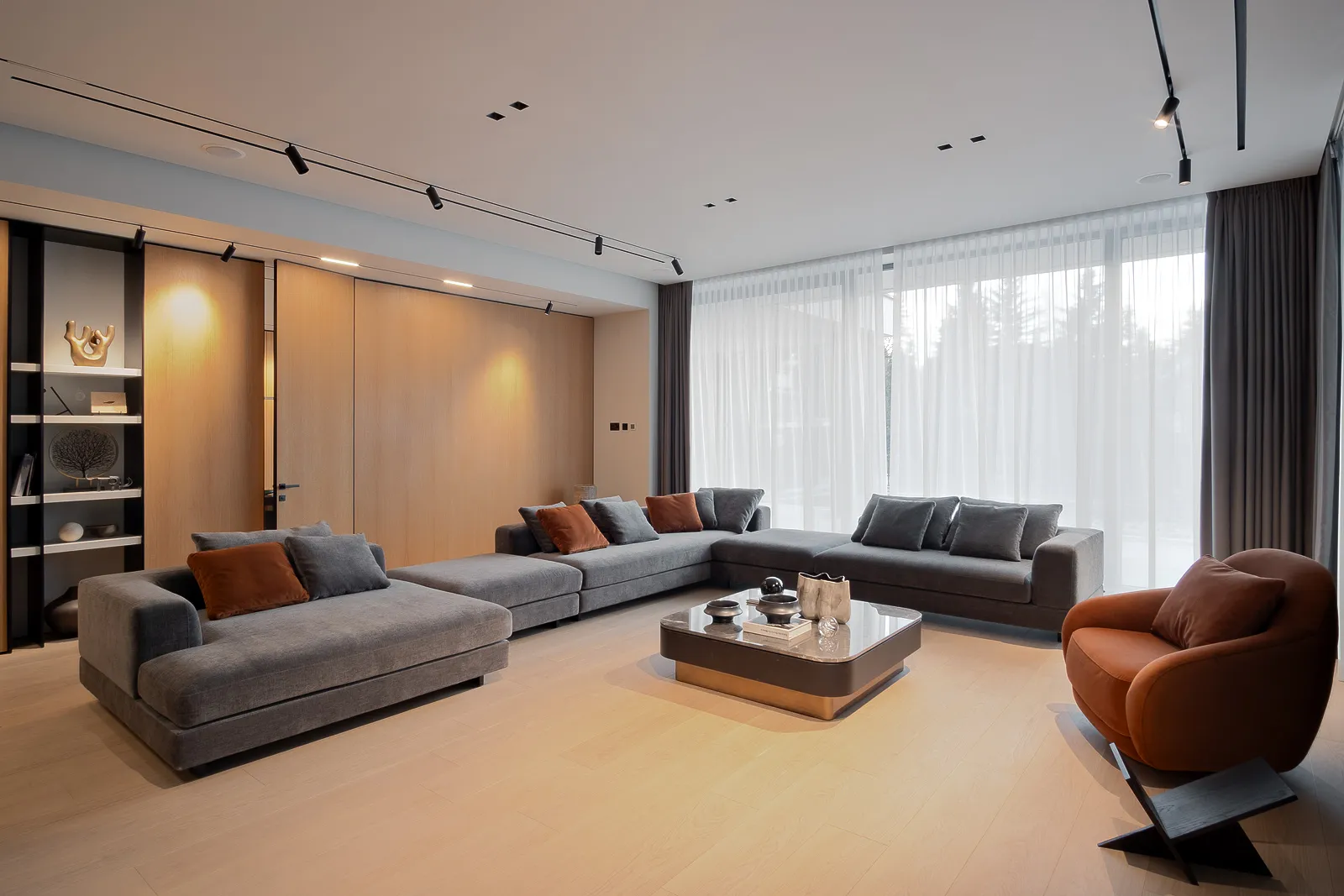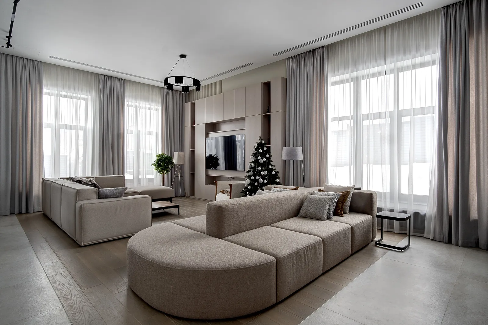
In the Nemo house near Moscow, the team built one large open-plan living room — solved through silhouette, light and fabric, not decoration.
The brief: maximum light, minimum furniture in its way
The 260 sqm Nemo house, built in 2026 in the Moscow region, was designed around one idea: floor-to-ceiling windows on two sides should remain the living room’s main event. The clients set the condition on the first meeting — minimal decoration, nothing that visually competes with the light.
This was not a vague "make it brighter" wish but a concrete constraint on furniture — any silhouette above windowsill height partly blocks the view from somewhere in the room, so the task was balancing comfortable seating against minimal visual obstruction.
Why two sofas in the end, not one large one
The first layout proposed one large corner sofa for the whole room — rejected because it would have blocked part of the view from the kitchen zone, and it clustered the whole family around one point rather than reflecting how evenings actually unfold.
Instead, a modular sofa curves around a low ottoman — a face-to-face conversation zone with no tall back in the light’s path. A second sofa faces it, against the media wall, creating a separate viewing zone — two different use scenarios in one room with no walls at all.
The bleached-oak media wall — the one warm accent
Against the neutral palette of walls and floor, the bleached-oak media wall with alternating open and closed sections is the one genuinely warm material in the room — open sections hold books and decor, closed ones hide electronics, giving the room its one tactile warm surface.
Light by day and by evening — voile and curtains in one tone
Floor-to-ceiling windows are dressed in sheer voile that softens daylight, with heavier curtains in the same warm beige tone flattening the evening contrast between a lit room and a dark garden outside — matching the tone keeps the room cohesive at any hour.
The challenge: keeping two sofas from competing with each other
The main risk with two sofas in one open room is a visual argument between them — if one is noticeably bigger or busier, the room reads as two interiors by accident. The fix was not identical sofas, but one shared silhouette logic and closely related fabric tones that tie different shapes into one composition.
Low profile and rounded forms were chosen for both sofas deliberately — at eye level from a seated position, neither creates a visual wall across the room, and rounded rather than square armrests soften the transition between two differently shaped pieces.
- One silhouette logic for both sofas — low profile, rounded armrests, regardless of configuration
- Two close, not contrasting, fabric tones — the room reads as one composition
- The one warm material — bleached oak — is not repeated elsewhere, to avoid splitting attention
- Window textiles match the curtain tone, not the furniture, tying architecture and decor into one palette
Why two fabric tones, not one
One identical colour on both sofas seemed the safest choice, but felt flat in practice. Instead, two tones in one warm family were chosen — lighter on the modular sofa, deeper on the one near the media wall, which sits in evening shade.
This solves a specific optical problem — a sofa in shadow against the darker media wall, in a pale fabric, would visually fade; the deeper tone keeps it present in the room at any hour.
Acoustics in one large room with no walls
An open 260 sqm plan with no walls creates its own acoustic issue — sound from the kitchen zone reaches the window conversation zone freely. The two upholstered sofas and their cushions absorb some of the sound walls would otherwise handle.
What would change in a smaller room
The underlying logic scales down without loss, but two full-size sofas work specifically because of the 260 sqm area — in a 35–45 sqm room, one sofa plus a smaller accent piece, like a chair or bench, makes more sense than a second full sofa.
The threshold below which a second full sofa stops working sits around 55–60 sqm of open zone — below that, two sofas leave too little walking space between them for comfortable conversation, even if both technically fit against the walls.
Window-to-sofa proportion — another calculation hidden from view
The sofa facing the media wall was sized so its length stays roughly two-thirds of the nearest window’s width — longer, and it visually competes with the opening; shorter, and empty space appears beside the window. This proportional rule is rarely discussed explicitly, but it is often behind the sense that furniture simply "belongs" where it stands.
Bleached oak versus dark veneer for the media wall: why light won
A dark walnut veneer media wall was considered at sketch stage — striking in a render, but in a room with this much natural light it would visually recede into shadow on an overcast day. Bleached oak reflects diffused window light almost as actively as the walls, staying consistent in any light.
The result: the room works full of family and empty alike
The real test of a layout like this is not a photo on handover day but how the room functions six months into ordinary life — in Nemo, the open living room works equally well with the whole family gathered at the media wall or one person reading alone by the window.
What of this translates to an apartment without 260 sqm
The no-wall zoning principle scales down too — even in a 40–50 sqm studio, a low furniture profile and one shared textile tone across two different pieces work the same way, creating one coherent space with distinct use scenarios rather than one undefined zone.
The low ottoman at the centre — not decor, the composition’s anchor
The low ottoman the modular sofa curves around was kept deliberately simple and low — a taller or more decorative piece there would have become a third focal point in a room already holding two. It works as a visual pause that keeps the curved composition reading as one shape, not scattered sections.
How evening light from the media wall changes the sofa fabric
In the evening, warm diffused light from the media wall falls on the nearer sofa, and the pre-chosen deeper fabric reflects it softly rather than absorbing it fully, as a flat matte dark fabric would. Fabric choice for this project was discussed under both daylight and the specific evening lighting to come.
Logistics: delivering and assembling two large sofas outside the city
Delivering large furniture to a country house is planned at the order stage, not the design stage — the modular sofa was delivered and assembled in sections rather than as one block specifically to avoid depending on doorway and stairwell widths. Final module alignment on site took a separate craftsman visit after delivery, standard for large modular pieces.
Timeline: how long the furniture scope specifically took
From sketch and fabric approval to final on-site assembly, the furniture scope took about 10–12 weeks — longer than the standard 5–8 for one sofa, since this meant two large sofas, a custom media wall, and syncing fabric delivery in two related but not identical tones.
What from this project is worth repeating at home
- One silhouette logic across all the room’s furniture, even differently shaped pieces
- No more than one genuinely warm accent material per open space
- Window textiles matched to the overall palette, not to the furniture
- Checking a layout after six months of real life, not just a handover photo
A note from a KALLEN HOME designer
"The hardest part was resisting the urge to add a third accent material — restraint in materials is what holds a room this large together. One warm accent for the whole living room was a deliberate choice, not a shortcut," says a KALLEN HOME designer.
Months after handover, the owners mentioned they most often gather in the ottoman semicircle rather than on the media-wall sofa, though both zones were designed as equally weighted — real use reshuffled priorities, a normal outcome for a room designed for living, not just for a handover photoshoot.
For the workshop this is not a reason to redo anything, but useful feedback for next time — in a similar project, the conversation zone could be planned as primary from the start, the media-wall zone as secondary in furniture character, even with equal floor area. A family’s real habits outweigh the plan’s original symmetry.
For any similar order we suggest bringing not just room measurements to the brief, but photos of how the family actually spends evenings there now, even in the old setup — such ordinary snapshots tell a designer more than a flawless floor plan with no one in frame.
The same lesson applies to custom furniture generally — describing the use scenario at the brief stage almost always cuts down on sketch revisions later, because the designer builds in the right proportions from the start rather than guessing from a vague "make it nice."
The real lesson of the Nemo project is not about a specific fabric or oak tone, but the order of decisions — first understand how the family actually lives in the space, then fit shape and material to that, not the reverse.
Frequently asked questions
What is the floor area of the Nemo project?
260 sqm, in the Moscow region, country-house category, completed in 2026.
Why does the living room have two sofas instead of one large one?
One large sofa would have blocked the kitchen-zone view and clustered everyone in one spot — two sofas create different use scenarios without walls.
How did they avoid a visual clash between two different sofas?
A shared silhouette — low profile, rounded forms — and two closely related, not contrasting, fabric tones on both sofas.
Can this layout be repeated in a smaller apartment?
Yes, no-wall zoning and one shared textile palette work in a 40–50 sqm studio too, not only in a 260 sqm house.
Can I see more photos of this project?
Yes, the full gallery and video are on the Nemo project page.